Scholarship and mentorship B2C platform
Leading Indian banking corporation
January to May, 2024 (5 months)
As a CSR (Corporate Social Responsibility) initiative, the platform provides underprivileged students an opportunity to secure an MBA scholarship. It also provides the students with a mentorship and networking platform.
Introduction
About the project
As part of their CSR (Corporate Social Responsibility) initiative, the leading Indian banking corporation wanted to provide MBA scholarships to underprivileged students nationwide.
They also wanted to provide a mentorship platform where rewarded scholars could seek guidance about their academics, and career path, and expand their professional network.
My team and I decided to divide the project into two phases. The first one would focus on checking the student’s eligibility and designing the scholarship application journey. Whereas, the second phase would focus on the mentorship program design.
Target Users
Primary - MBA students across the country
Secondary - Bank employees that provide mentorship, college alumni members
My role
I worked as the primary product designer, and junior project manager. I was responsible for dealing with the stakeholders such as the business team, the development team and the head of design.
Project duration
6 months, January to June 2024
Supported devices
Mobile, desktop
Understanding the scope
As I got onboarded to the project, I met the business team to get more details of the project. I was given the BRD for reference including details such as the amount awarded, eligibility criteria for the students applying, and the platform the web app was going to built on.
Snaps of the BRD (Business Requirement Document)
To apply for the scholarship program, there is an eligibility criteria that the student must fulfil. It includes things such as:
• Having an Aadhaar card
• Applying for the 2023/24 full-time MBA program
• Having an annual family income below 6 lakhs
• Not having a relative working at the same bank
An existing user journey was provided by the business team to help us designers understand the current end-to-end process. It was divided into four sequential journey points that include:
• Student eligibility check
• Scholarship application form
• Document verification
• Application granted/denied
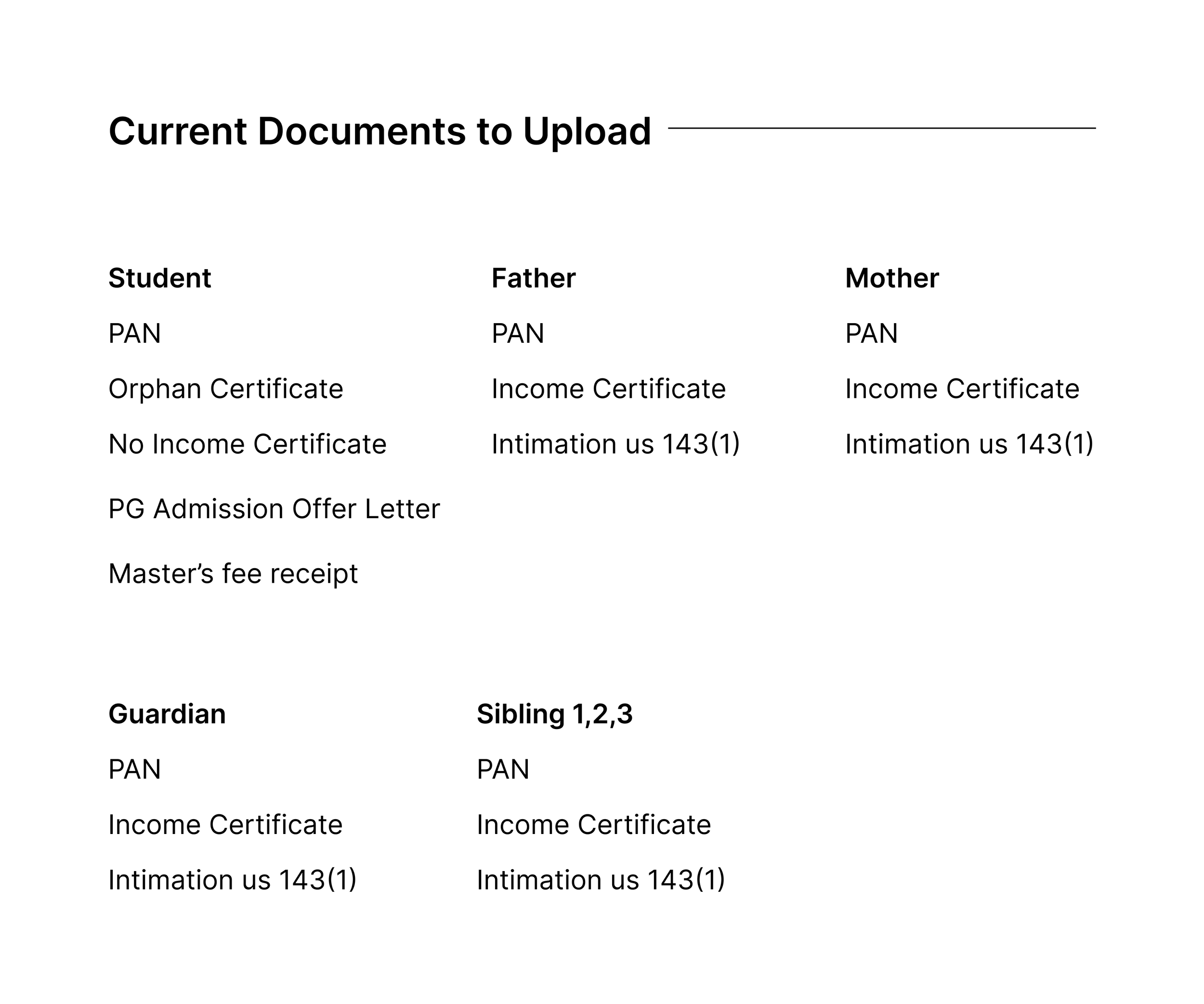
List of all documents that could be required from the student
If the student is eligible to apply, depending on whom they select as the earning members of their family, they would need to upload income-proof documents for each earning member.
Analysing the existing platform
We were given screenshots of the existing platform for research and analysis purposes. I performed a heuristic evaluation to understand and gather the areas of improvement. It was also a good reference for the next design
The log-in page
1 - There is too much negative/white space on the page.
Aesthetics and minimal design
2 - The get otp button is given the same visual treatment as the primary action button i.e. log in.
Consistency and standards
3 - While the user hasn’t entered the credentials yet, there is already an error message saying “Invalid credentials”.
Error prevention
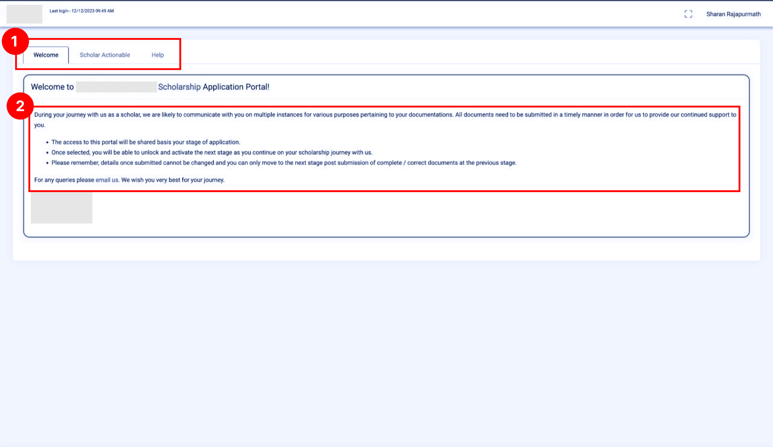
Perpetual Welcome Page ?!
1 - A welcome message is represented as a tab on the screen. Such a message is generally used for first-time users only. In cases of returning users, it seems redundant.
Consistency and standards
Error prevention
2 - The font size of the body text is difficult to read.
Consistency and standards
Student application form (read only) page
1 - The colour contrast between the tab the user is on and the rest is not clear enough.
Consistency and standards
Error prevention
2 - The amount of screen space the tabs/journey points section occupies seems excessive.
Aesthetics and minimal design
3 - The font size of the read-only version of the student application form is low. It is not easy to read.
Consistency and standards
4 - The labels and the input text have the same visual treatment. It makes it difficult to differentiate between which is which.
Consistency and standards
5 - The declaration checkboxes, which is a mandatory interaction on the screen, is barely visible
Error prevention
Consistency and standards
Document verification page
The font size here is also a big issue as it is not easily readable.
Also, it seems like the table is occupying more screen space than required.
Consistency and standards
Aesthetics and minimal design
Scholarship status page
On the scholarship status page, there are no details regarding whether the scholar has been awarded or not. Instead, there is a fee payment table.
Match between system and real-world
Visibility of system status
Marksheet upload page
From a sequence or hierarchy point of view, asking the student to upload their marksheets post being awarded the scholarship seems redundant/illogical.
Error prevention
Help page
80% of the help page is only white/negative space.
Consistency and standards
Designing the eligibility form
Before starting the wireframe design process of the eligibility form, it was imporant to gain clarity on the end-to-end process of the student. In other words, the start to finish user journey of a student looking to apply for an MBA scholarship.
To gain clarity on this, I created a flow diagram of the process
The business team provided us with the list of questions to be answered by the students. I created a flow diagram to understand how the student would be eligible. What answers must the student select to be eligible and not eligible too.
So only if the student selects all answers marked in green are they eligible to apply. However, if they select any one answer in red, they are instantly not eligible for the scholarship program.
Student eligibility form - flow diagram
This wasn’t working… time to categorise the questions
Student eligibility form - wireframe iteration 1 (All in one page)
For the first iteration, I decided to try out a one-page approach.
However, there were UX and VD issues with this design.
UX issue - Since checking eligibility per question in real-time was back-end effort heavy, the user would only know if they were eligible once they submitted the entire form—more user effort.
VD issue - The entire form is not visible in the viewport, making the user wonder how long the form is.
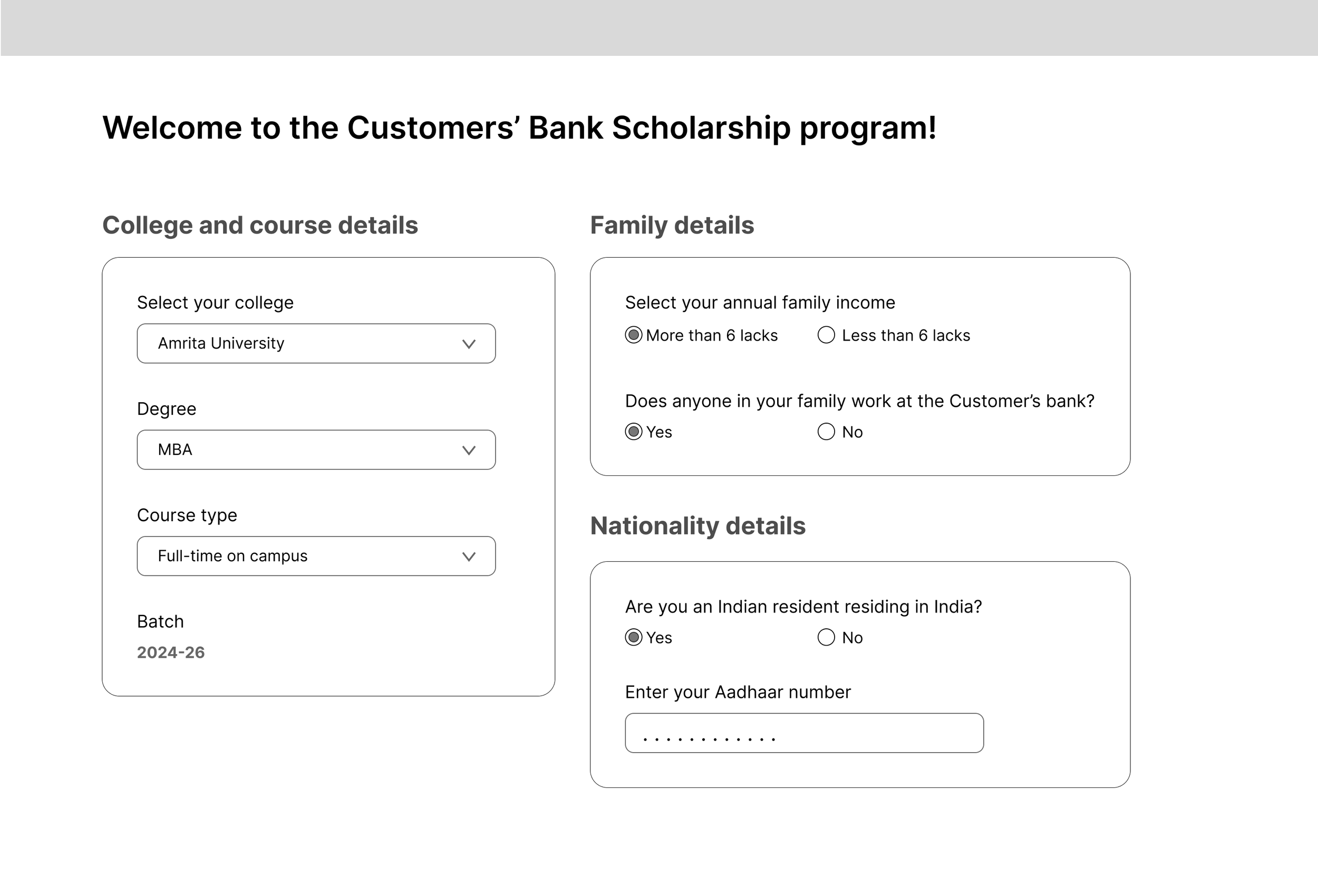
I broke the question down into 3 sections/categories:
• College related
• Family and income-related
• Nationality related
Doing this would reduce user effort to know their eligibility status, and it would keep the form within the viewport
Student eligibility form - wireframe iteration 2 (Adding Checkpoints)
Integrating it into the landing page
The journey of the eligibility form starts and ends on the Landing page itself
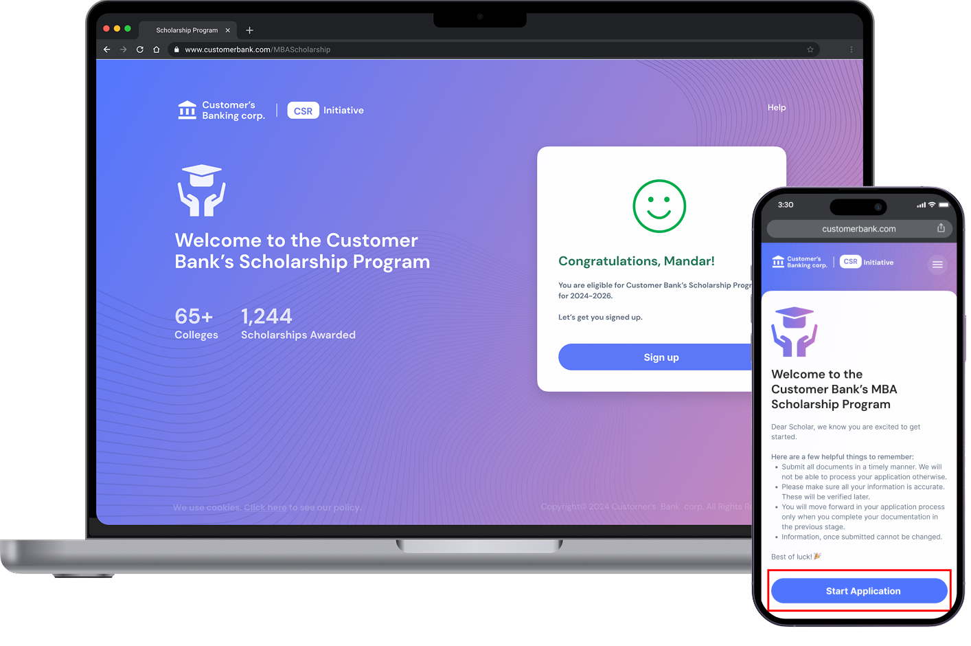
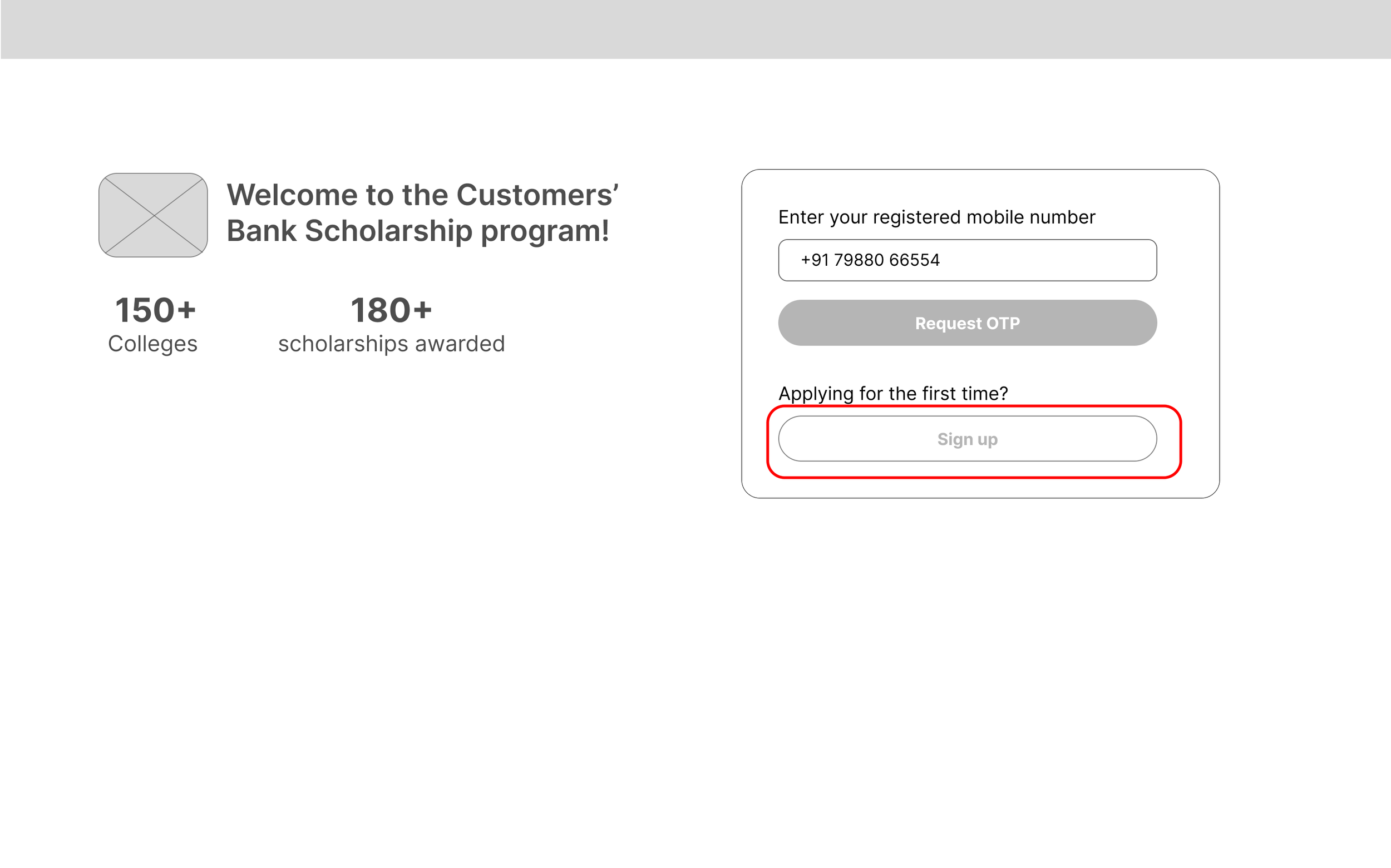
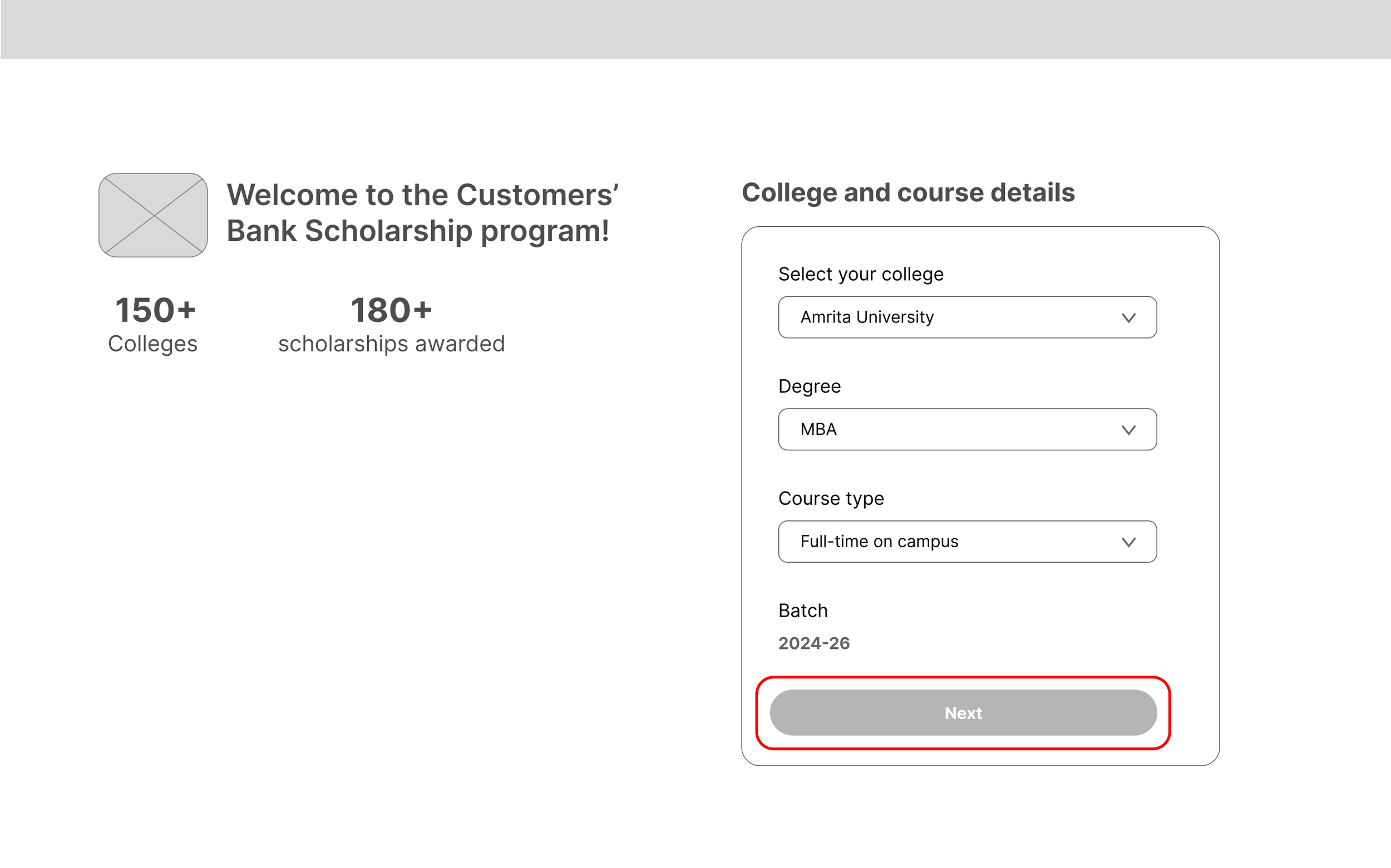
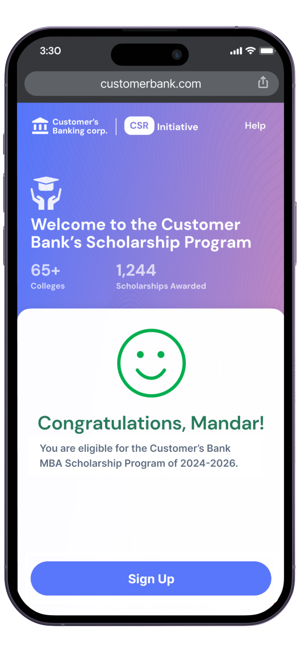
Once the user clicks Sign up, they are presented with the eligibility form on the same page, keeping the flow smooth and uninterrupted.
Rather than having to fill all the form fields to know their eligibility status, we broke them down into checkpoints.
On filling a section, they know their status immediately.
If they pass all three eligibility checkpoints, we allow the user to sign up for the program
Designing the scholarship application form
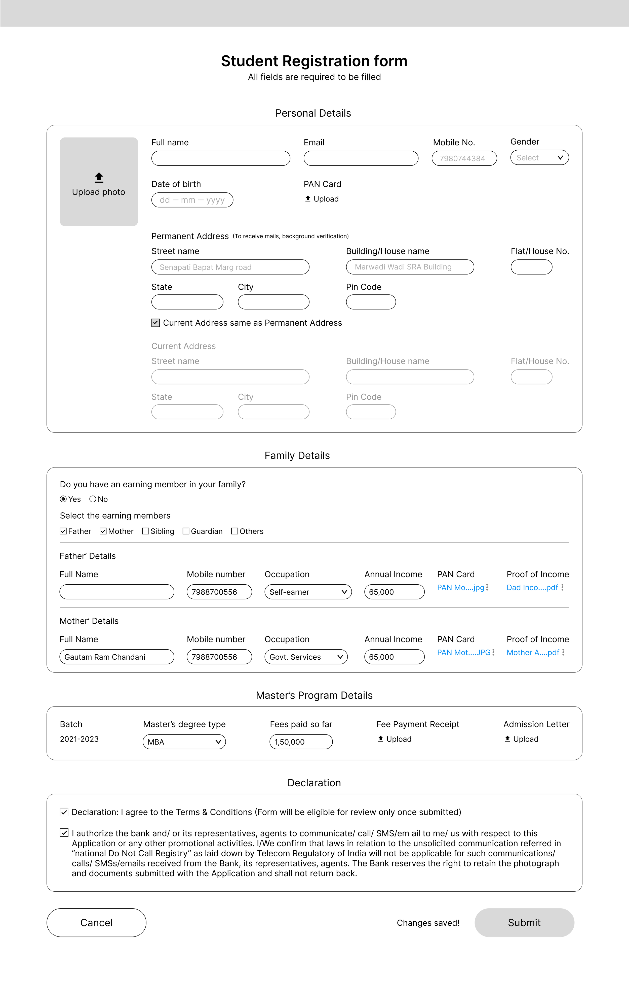
For the scholarship application form, there were three user information areas to work on.
Personal information - things such as name, age, DOB, address and so on
Family income details - family members of the student who are earning, their names, profession details, income amount
MBA program details - The college/university the student wants to enrol in, batch year, and admission letter as proof
Although the business team had provided us with the list of fields and an overall picture of what the solution would look like, as designers, it was our job to ensure we made the process as easy to use and intuitive as possible.
Since Phase 1 was a very form-heavy design-wise, not much user research was involved or required here. Stakeholder management was the key skill in ensuring the value of our designs was understood and implemented.
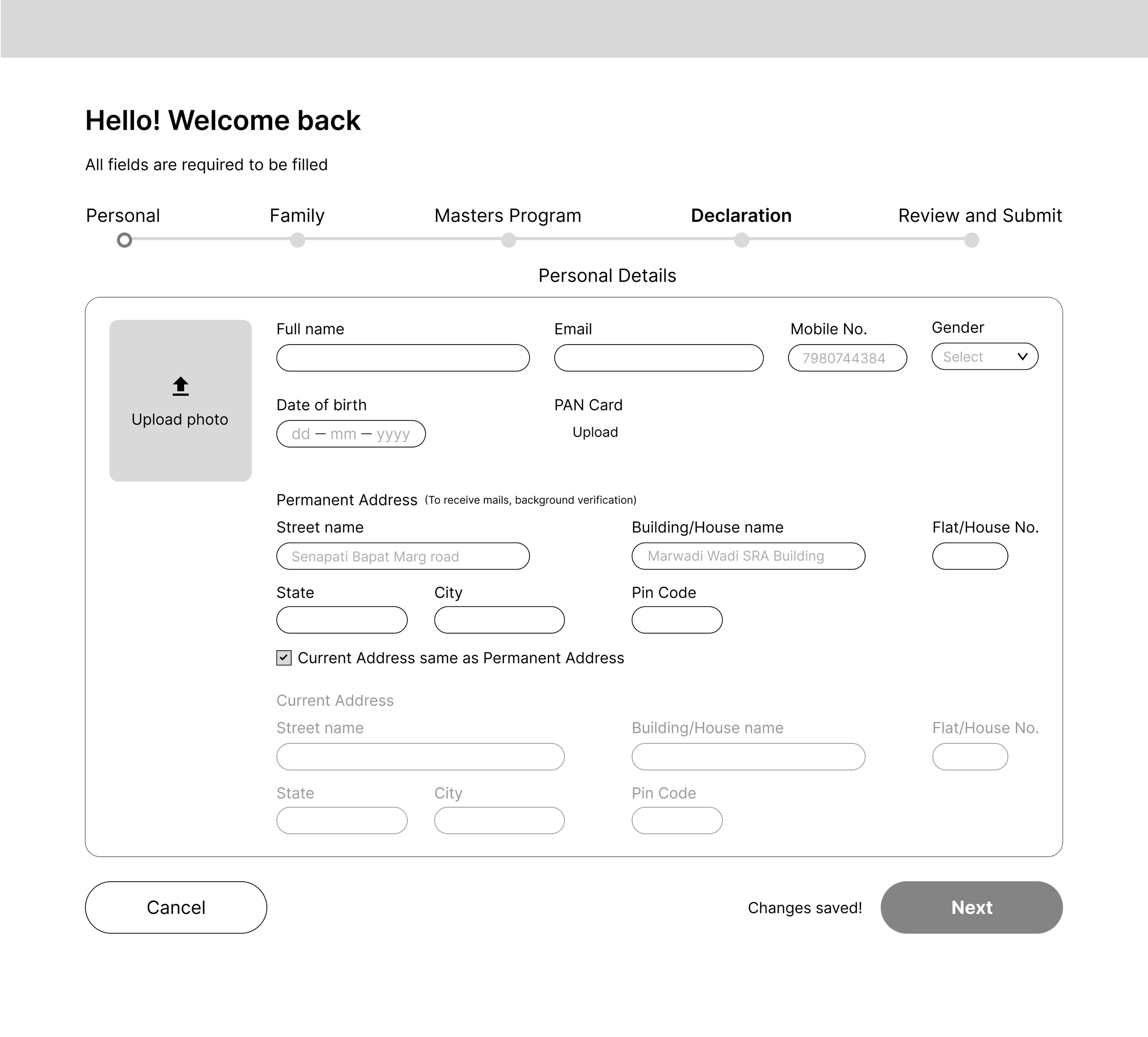
Application form - wireframe iteration 1 (All in one page)
Pros
• The user is well informed of all that’s required in terms of forms to be filled and document uploads
• Flexibility - The user can choose which area of the form or which fields to fill first to last.
• Auto-save - Any input, undo, or other action for that matter
Cons
• Cognitive overload - At first glance, the number of fields and overall information is a lot.
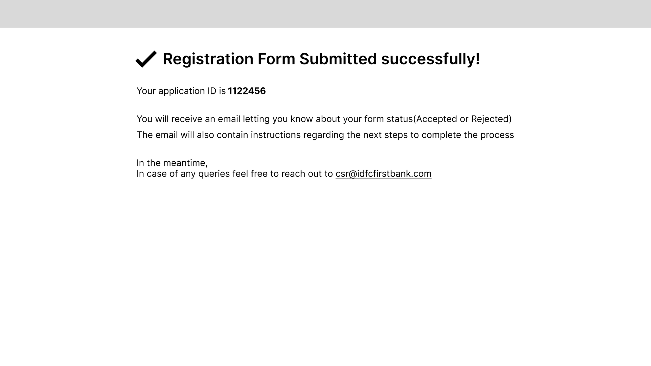
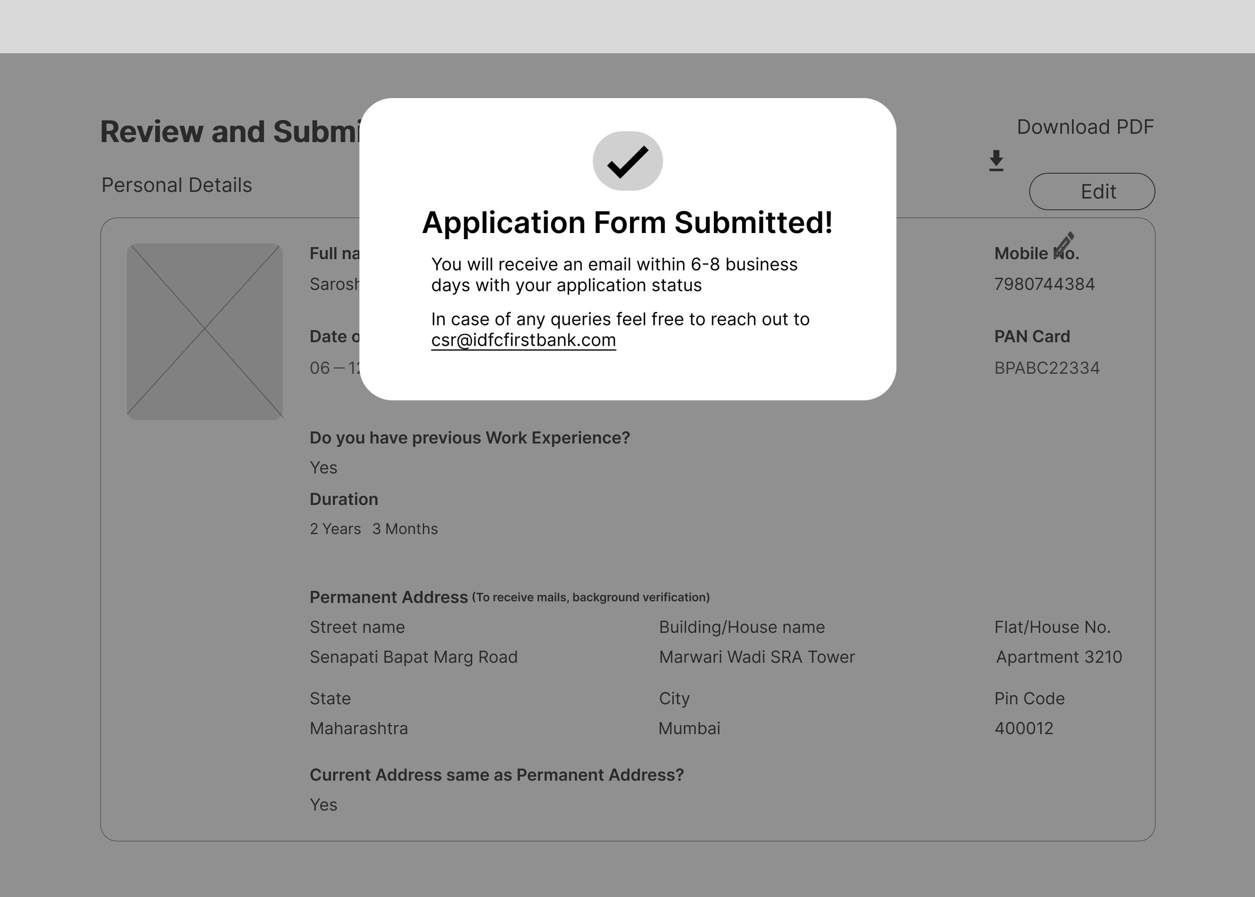
• Having an entire page dedicated to form submission confirmation seems a bit overkill. Rather having a modal window show up on the same page won’t break the flow or scare the user for a few seconds.
Pros
• Low cognitive load - the user is presented with less information by dividing the form into checkpoints. It is less overwhelming and appears more doable/manageable.
• Keeping the user informed - By showing all the checkpoints required up top, the user knows where they are in the journey and how much is left for completion.
Cons
• Restrictive/Linear approach - Although the process seems easier and is more structured, allowing the user to proceed to the next step only after completing the current one takes away their freedom.
Application form - wireframe iteration 3 ( required steps as tabs )
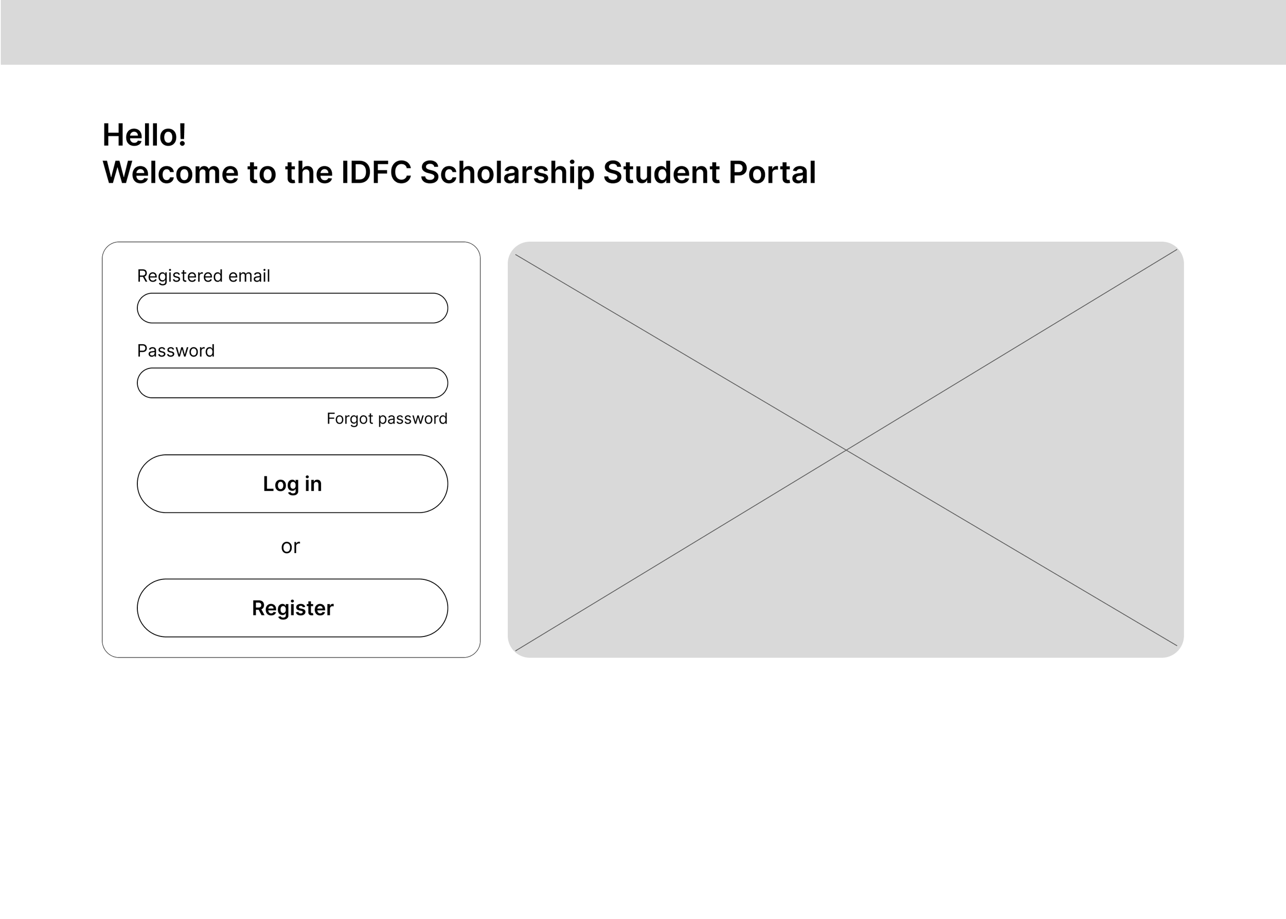
The Landing page
Eligible students can start their scholarship application form by logging in. Whereas new students can click register to begin the eligibility process.
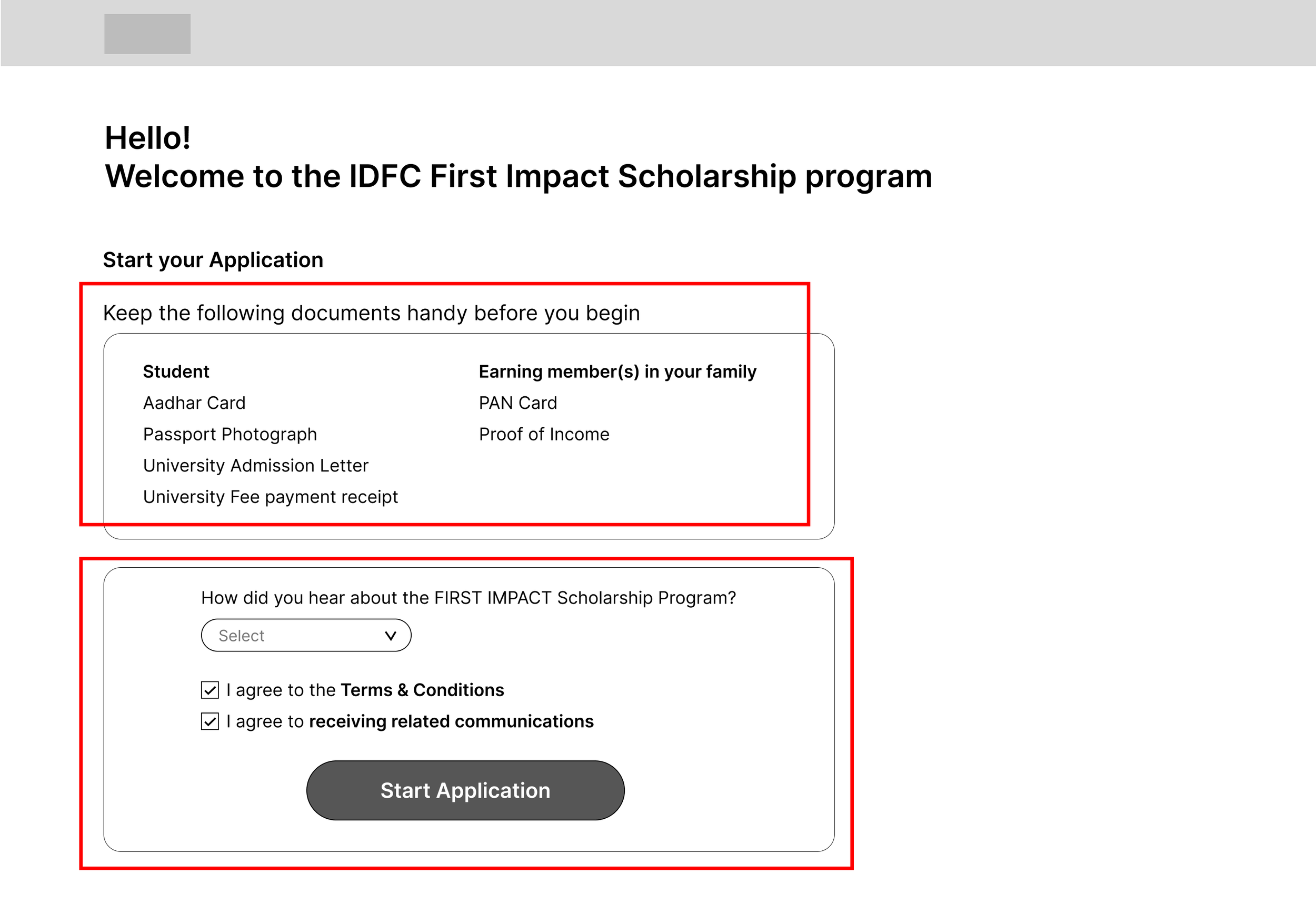
Start application page
Letting the students know all the documents required before starting the process would help them be more informed.
For marketing analysis purposes, we wanted to ask the students where they heard about the scholarship process. Asking them the question before they begin the application process was more effective.
The scholarship application form as tabs
Pros
• Flexibility - dividing the process into 3 tabs gave the users the option to jump between each and fill the form according to their preference.
• Low cognitive load - Showing the users that there are only 3 steps to complete the process, each having only one form made it more approachable and friendly.
Application form - wireframe iteration 2 (Sequential/step by step)
The final product
Step 1 - check your eligibility
Returning students can sign in here, whereas new students can begin their eligibility check by clicking sign up
Step 2 - Sign up on the platform
Sign up flow
The sign up process requires the student to enter their mobile number and email ID with respective OTPs one time only.
Step 3 - Apply for the MBA scholarship
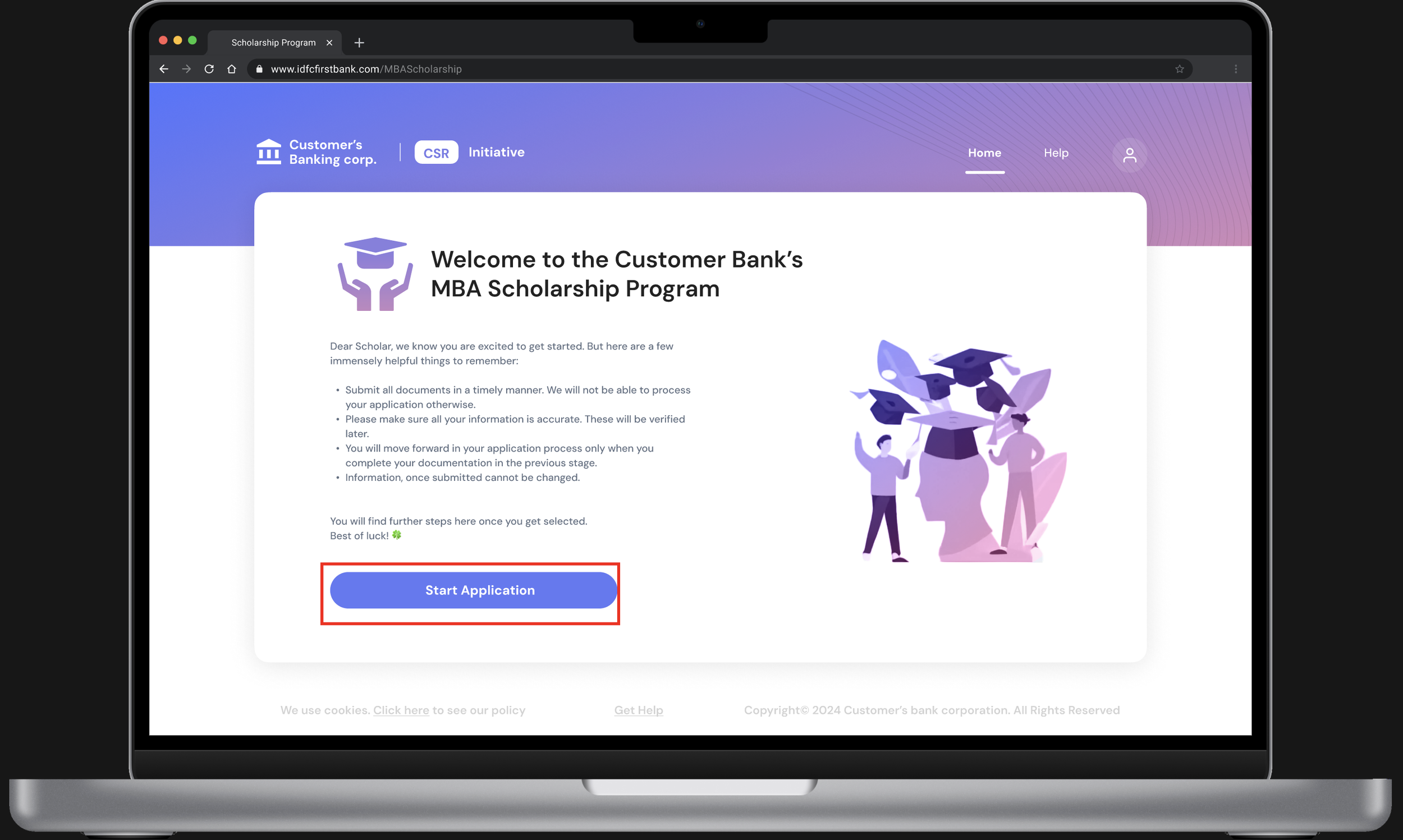
The landing page - new applicant
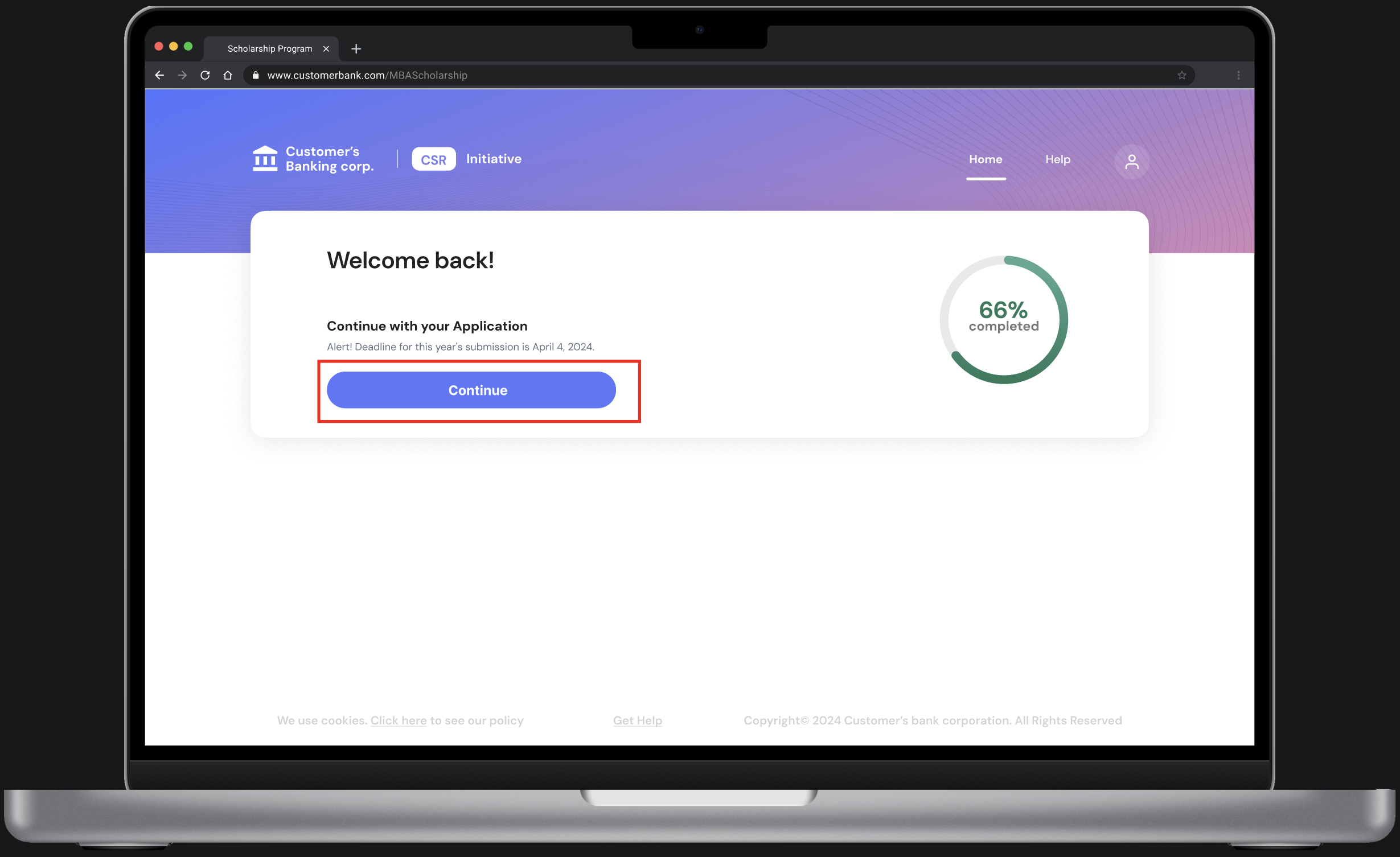
The landing page - returning applicant
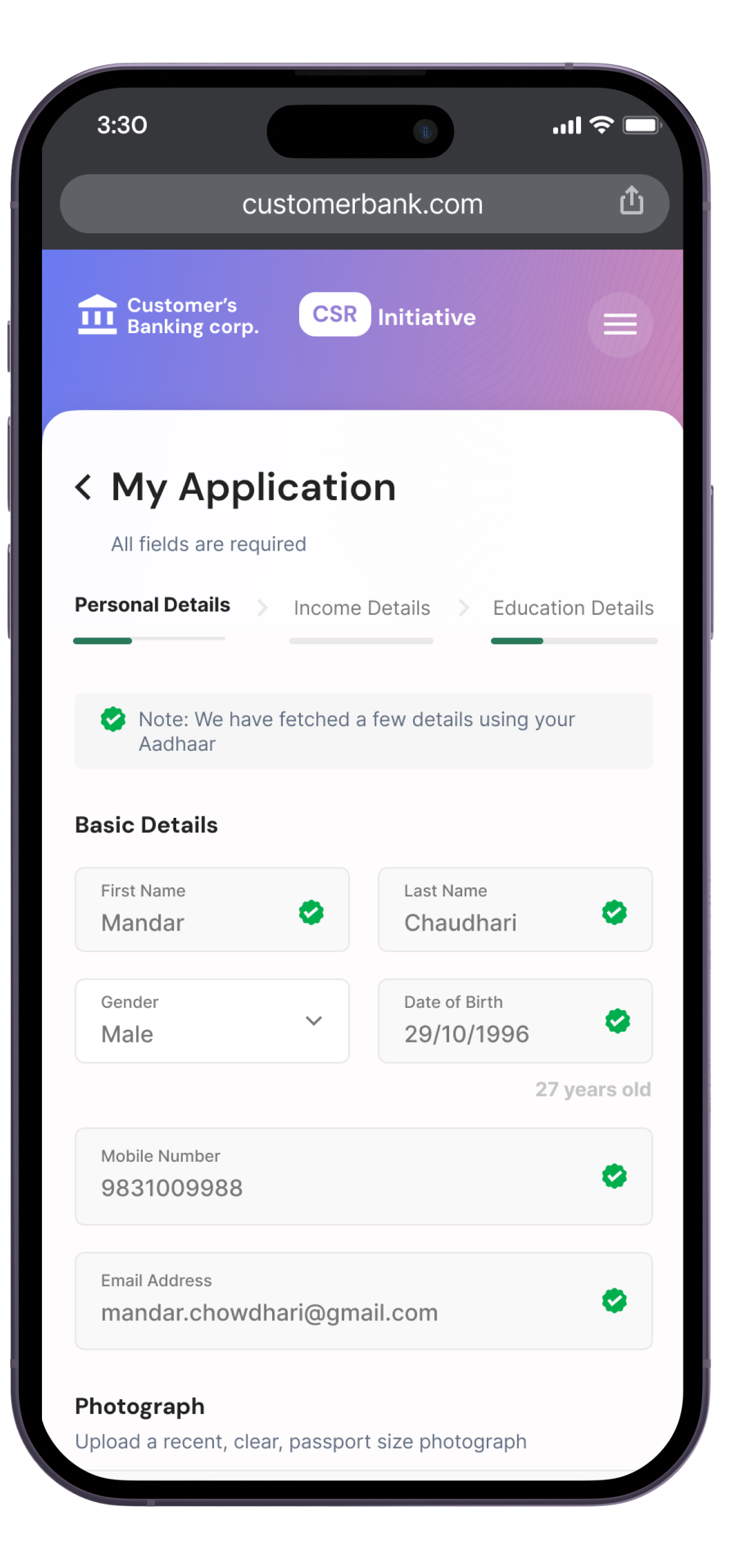
The application form part 1 - Personal details
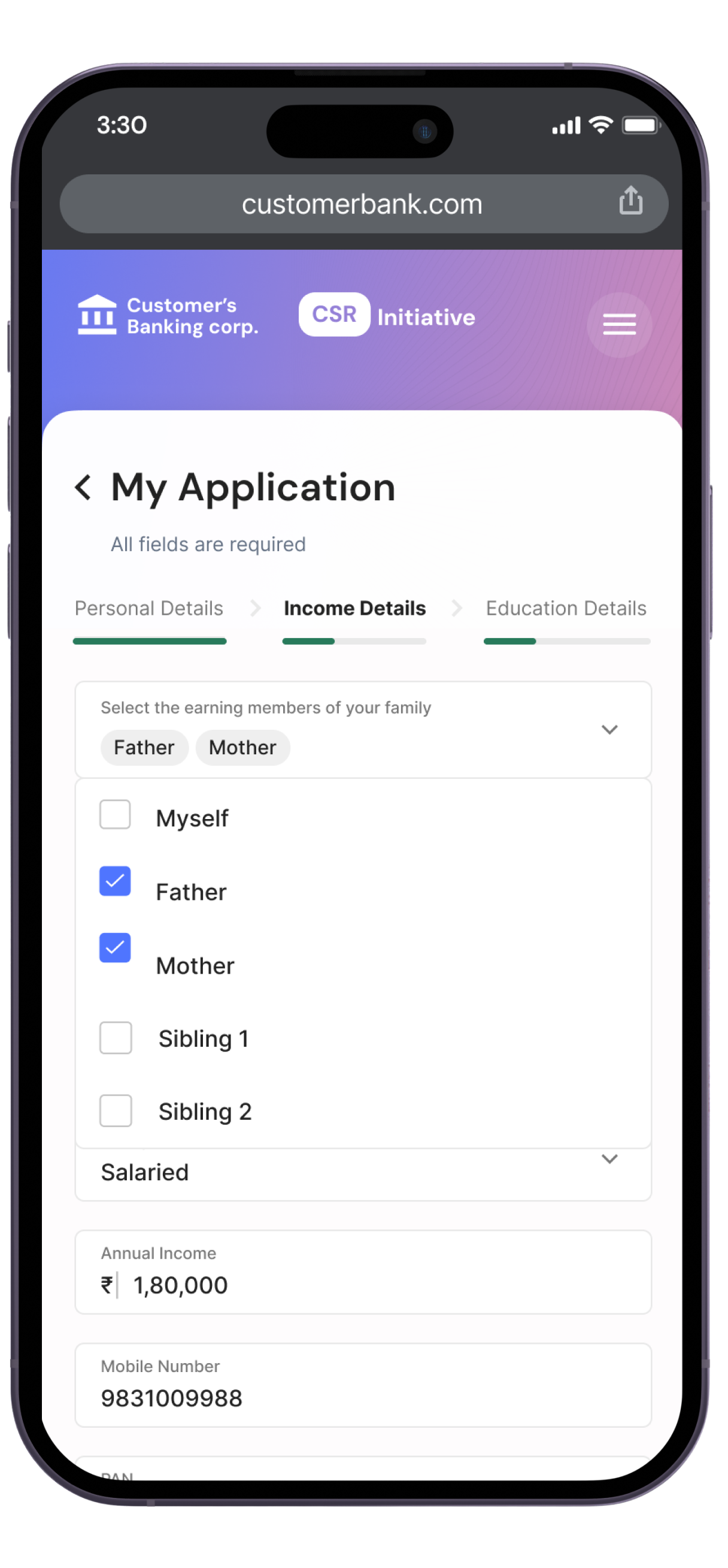
The application form part 2 - Income details
The application form part 3 - Education details
Review application form before submitting
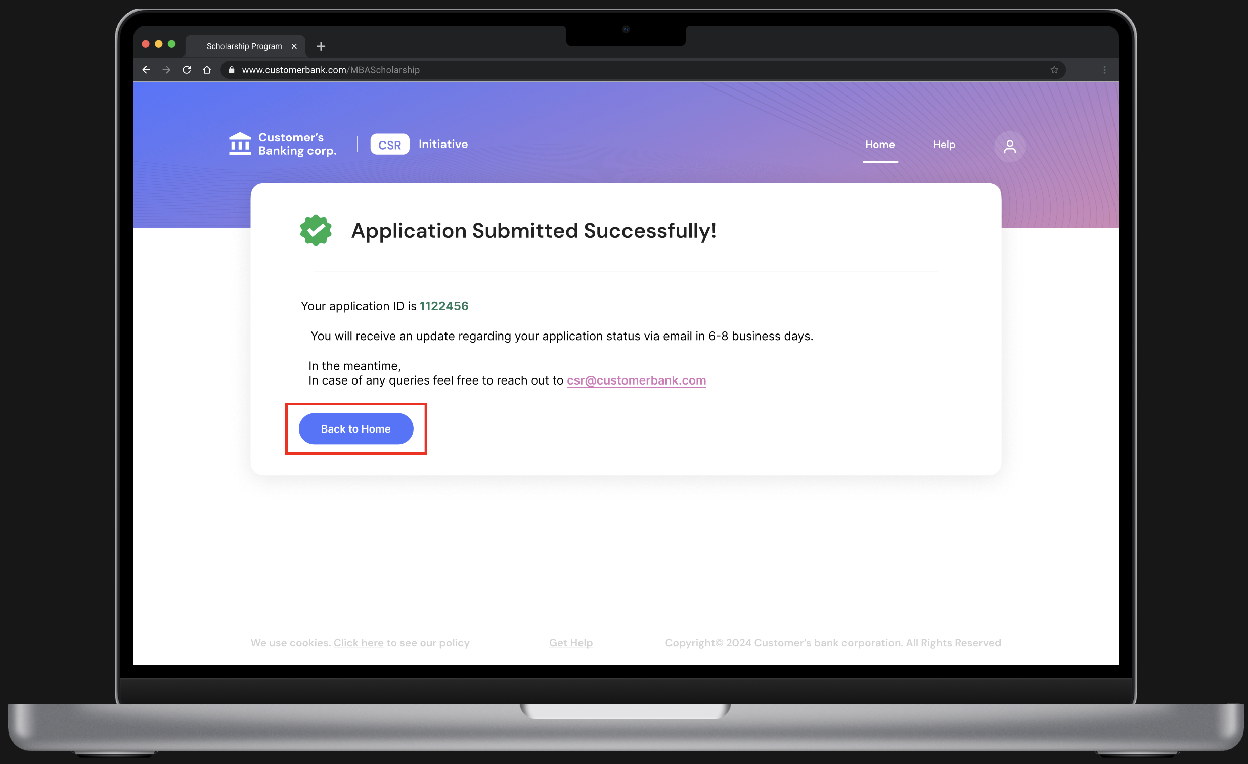
Application submitted successfully!
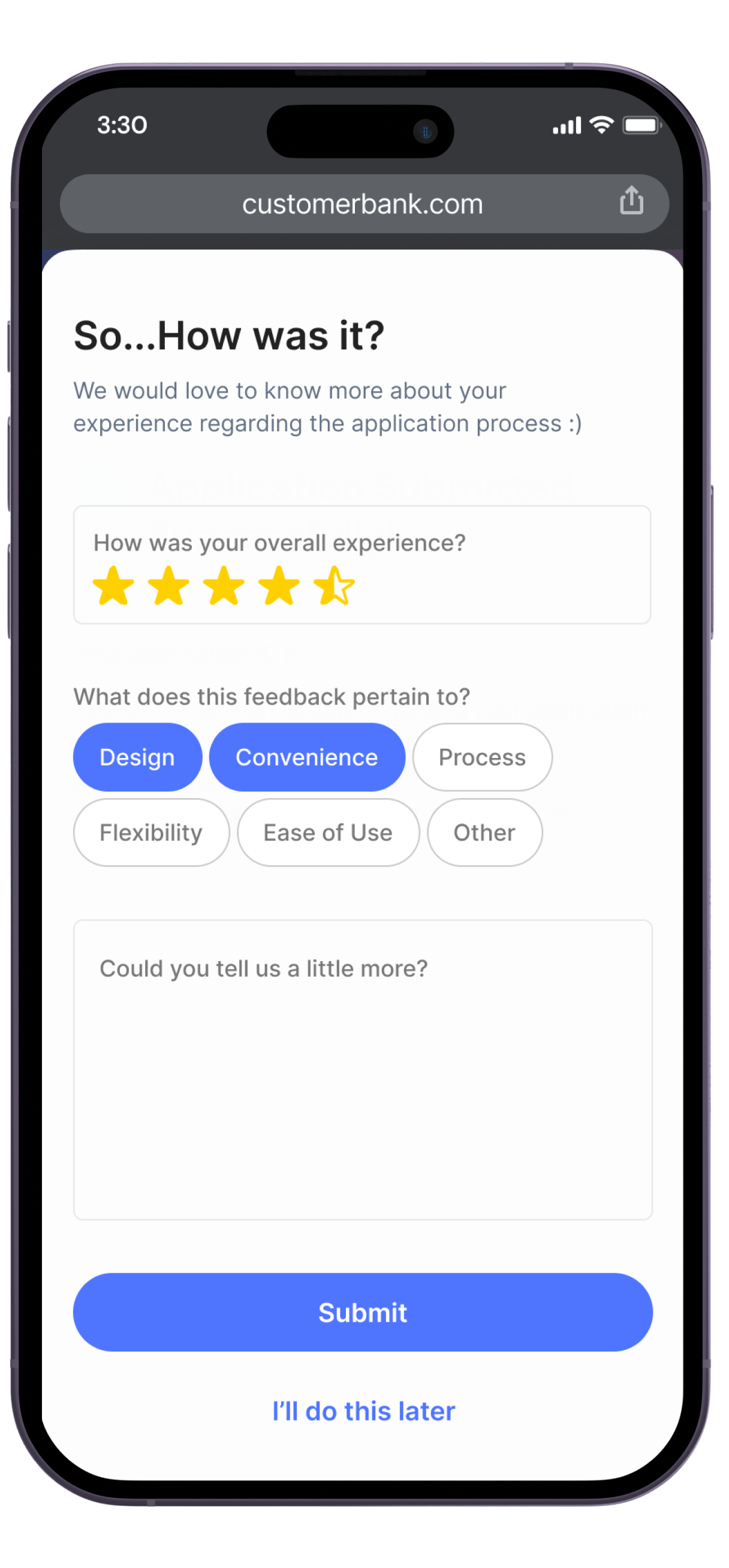
Gathering user feedback on the application experience (micro feedback form)
Real-time application status updates
The Help Section
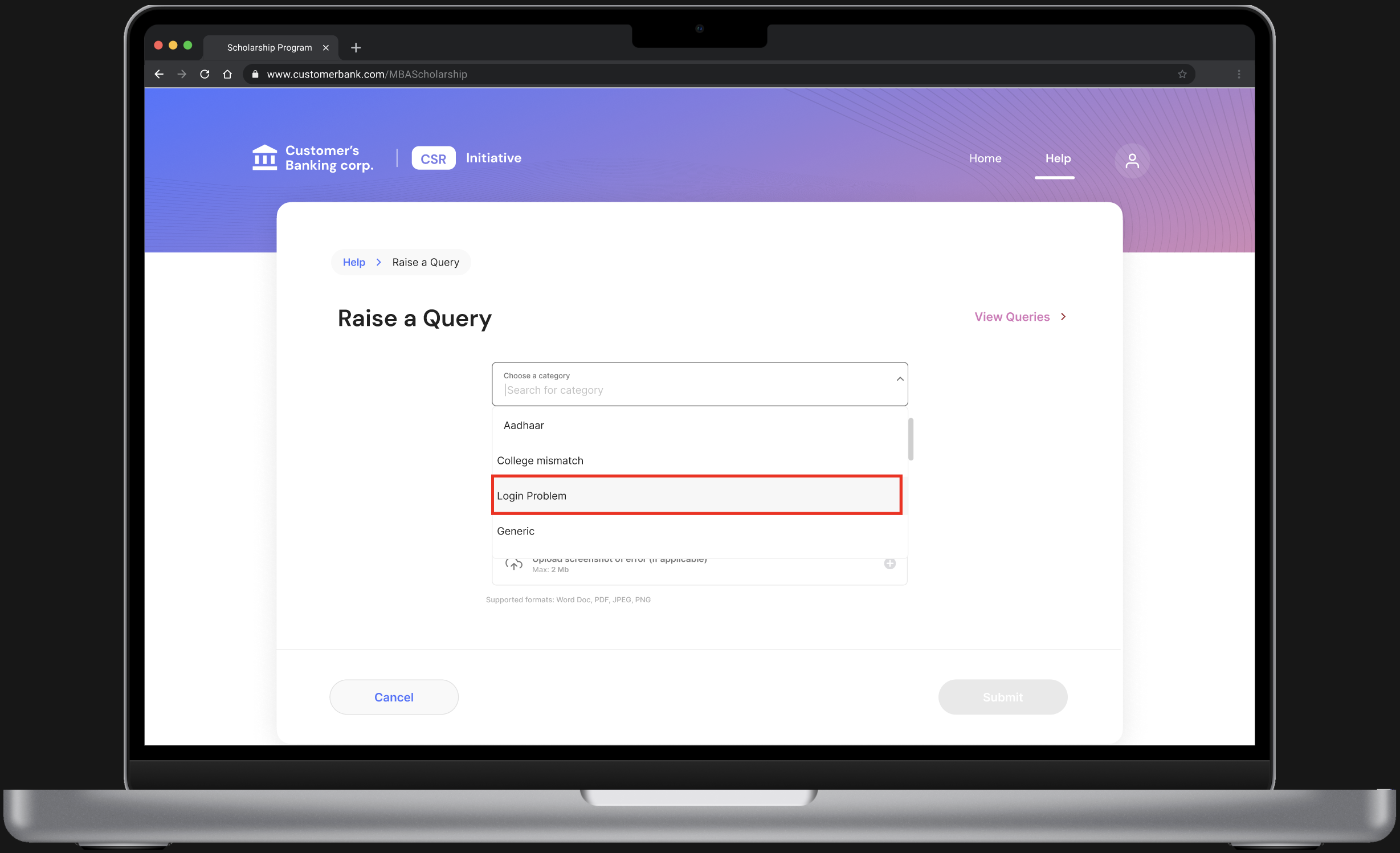
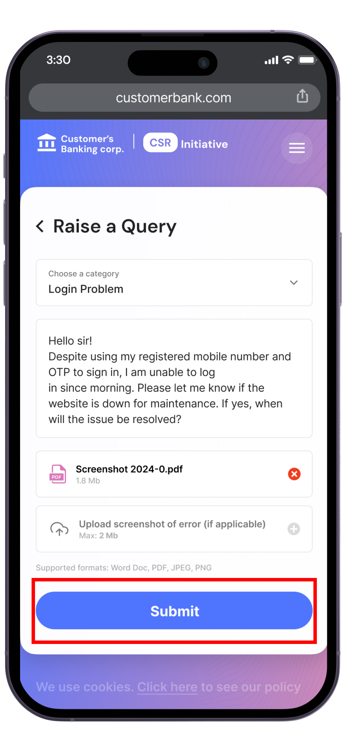
Raising a new query - Select category
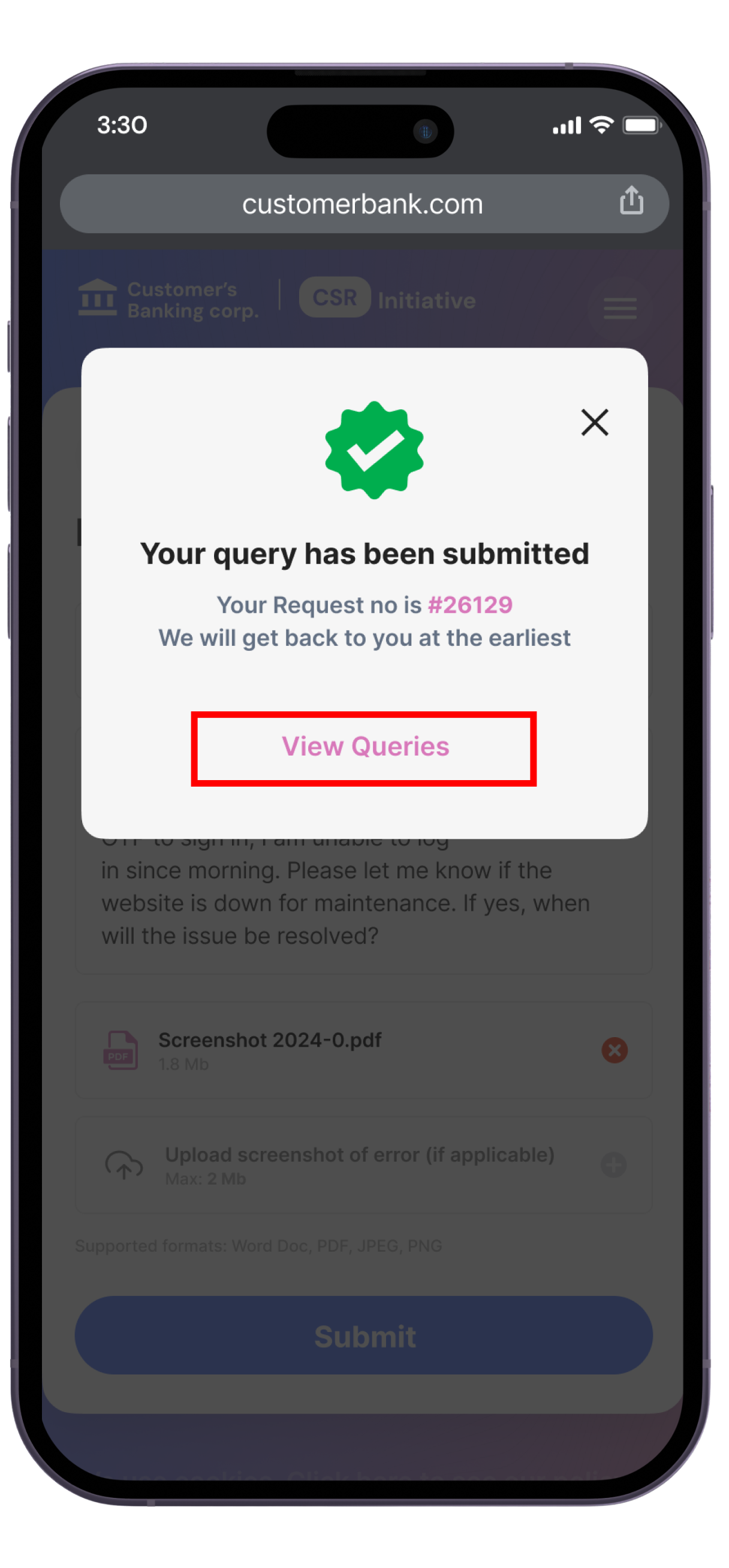
Query submitted confirmation!
View previous queries
Key findings
Stakeholder management
Although the business and development teams have ideas for the product, we designers are responsible for verifying these ideas and making changes for the better wherever required. Rather than dealing with such situations with arrogance by saying we are the designers we will decide the look and feel, it is important to explain and whys and the hows behind our designs so that everyone on the team is on the same page.
Applying progressive disclosure for long-form designs
When designing forms that have many questions and selections, it is important to use the progressive disclosure design principle to not overwhelm the user at first glance. Although having all fields and selections on one page gives the user more clarity on the task in hand, it makes the experience less pleasant.
Project Management skills
While I was primarily a designer on this project, I had other project-related responsibilities as well. These included creating user story and tracker documents, stakeholder management, overseeing the front-end development quality, and providing status updates to the design head and the department head.
So what all did I learn during this phase of the project?

