Scholarship and mentorship B2C platform
Leading Indian banking corporation
January to May, 2024 (5 months)
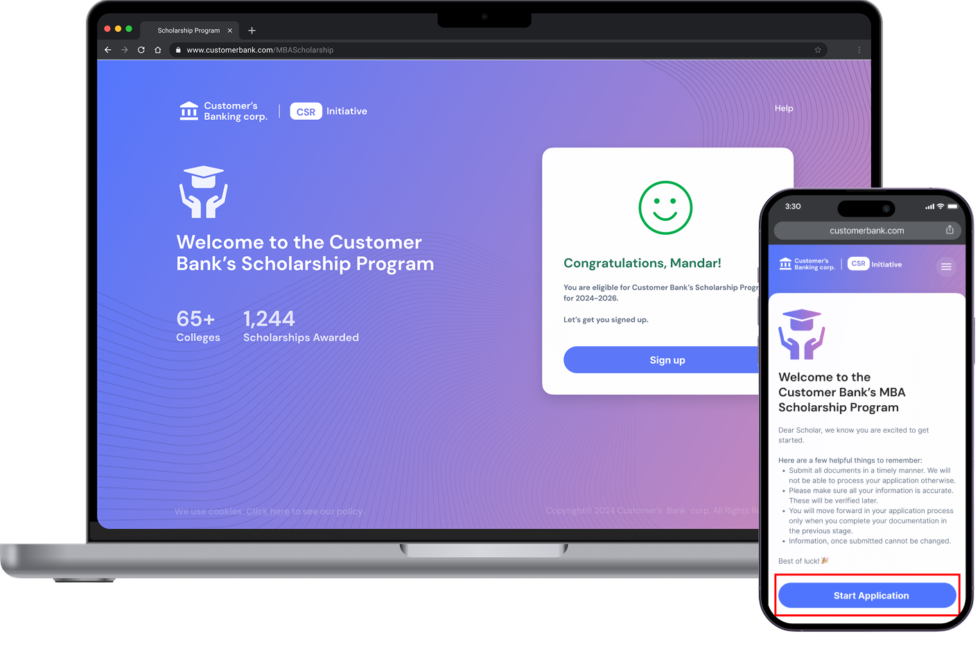
As a CSR (Corporate Social Responsibility) initiative, the platform provides underprivileged students an opportunity to secure an MBA scholarship. It also provides the students with a mentorship and networking platform.
So, what’s new in phase 2?
The project's first phase included checking the student’s eligibility and the process to apply for the scholarship.
Once the student is awarded the scholarship money, what next?
The business team had an idea that we could provide students with a mentorship platform to help them with things such as academics, job/internship finding, and lectures on trending topics in business.
The banking corporation (my client) also had an incentive program for employees. Essentially, the employees could volunteer to be mentors and dedicate certain hours every month to help the bank in their CSR (Corporate Social Responsibility) initiative.
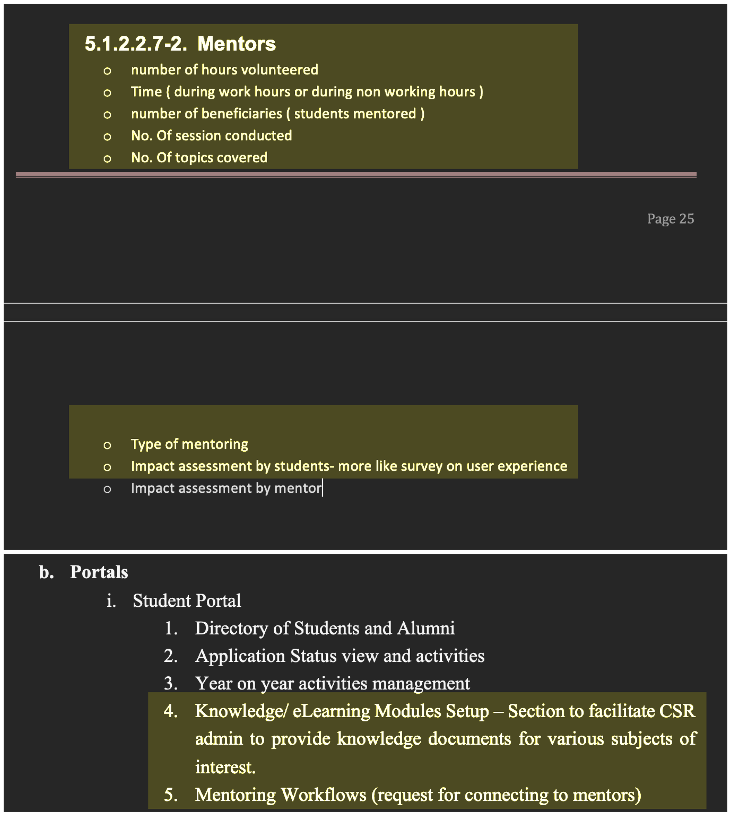
Reference image of the BRD
Key features requested
• Connecting with mentors
• Having a record of all all previous sessions with selected mentor
• having multiple mentorship topics
• Professional networking with Alumni members and fellow scholars
Time to validate the idea with our target users
After our discussions with the business team about the scope of phase 2, it was time for us designers to understand more about the mentorship and networking idea. To do this, we needed to hear more about it from the target users. We needed to validate the idea first and dig deeper to understand everything the scope could include.
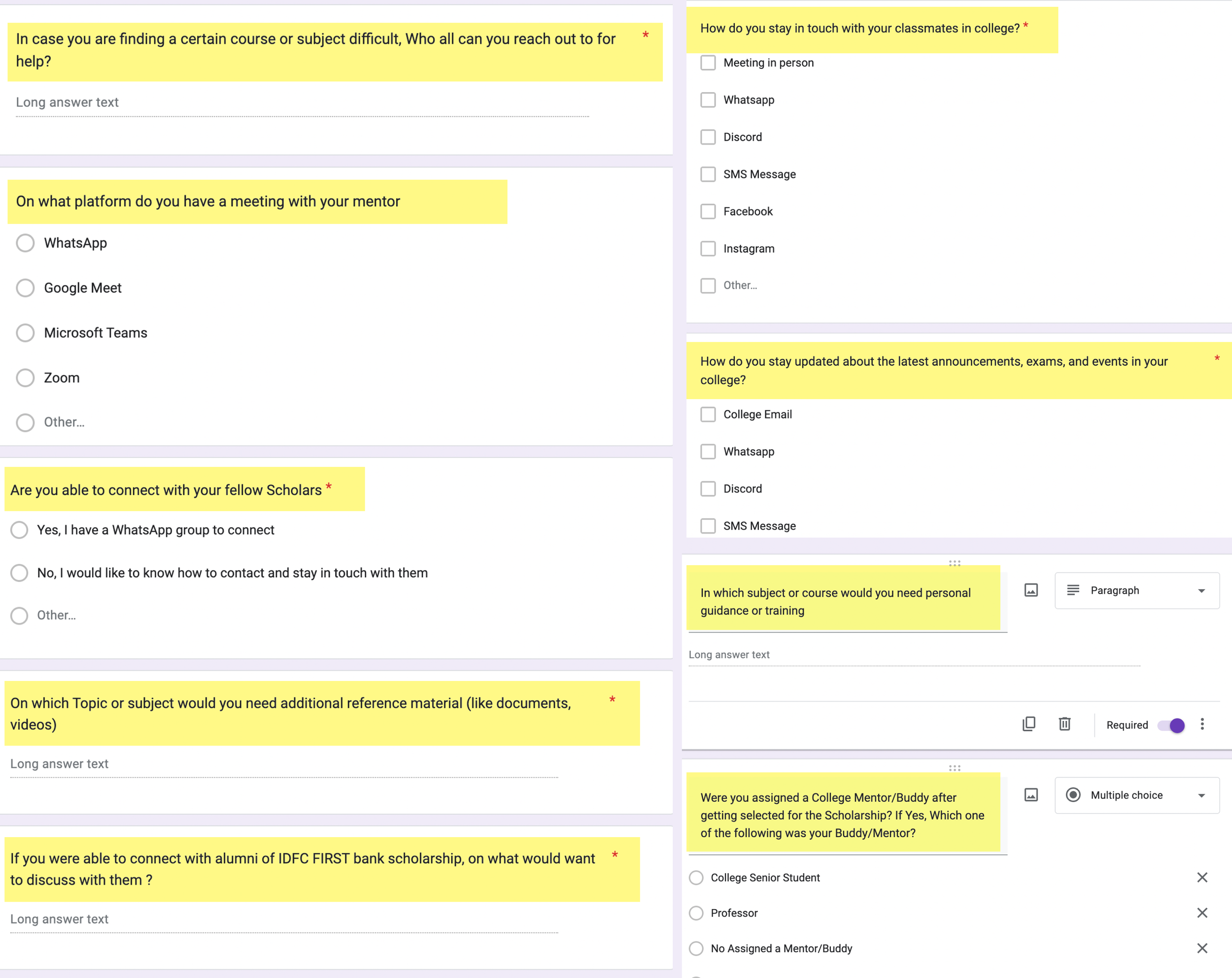
User interview questionnaire - iteration 1
User interview questionnaire - iteration 2
VOC (voice of customer)
Survey insights
Networking
Students are very much interested in networking with fellow scholars and alumni members. According to the survey responses, it will help them with:
• Building relationships / improving people skills - 55%
• Career growth and future opportunities - 20%
• Learn more by listening to other people’s experiences - 25%
Professional growth
Coming to professional growth, students are keen to seek guidance in the following areas:
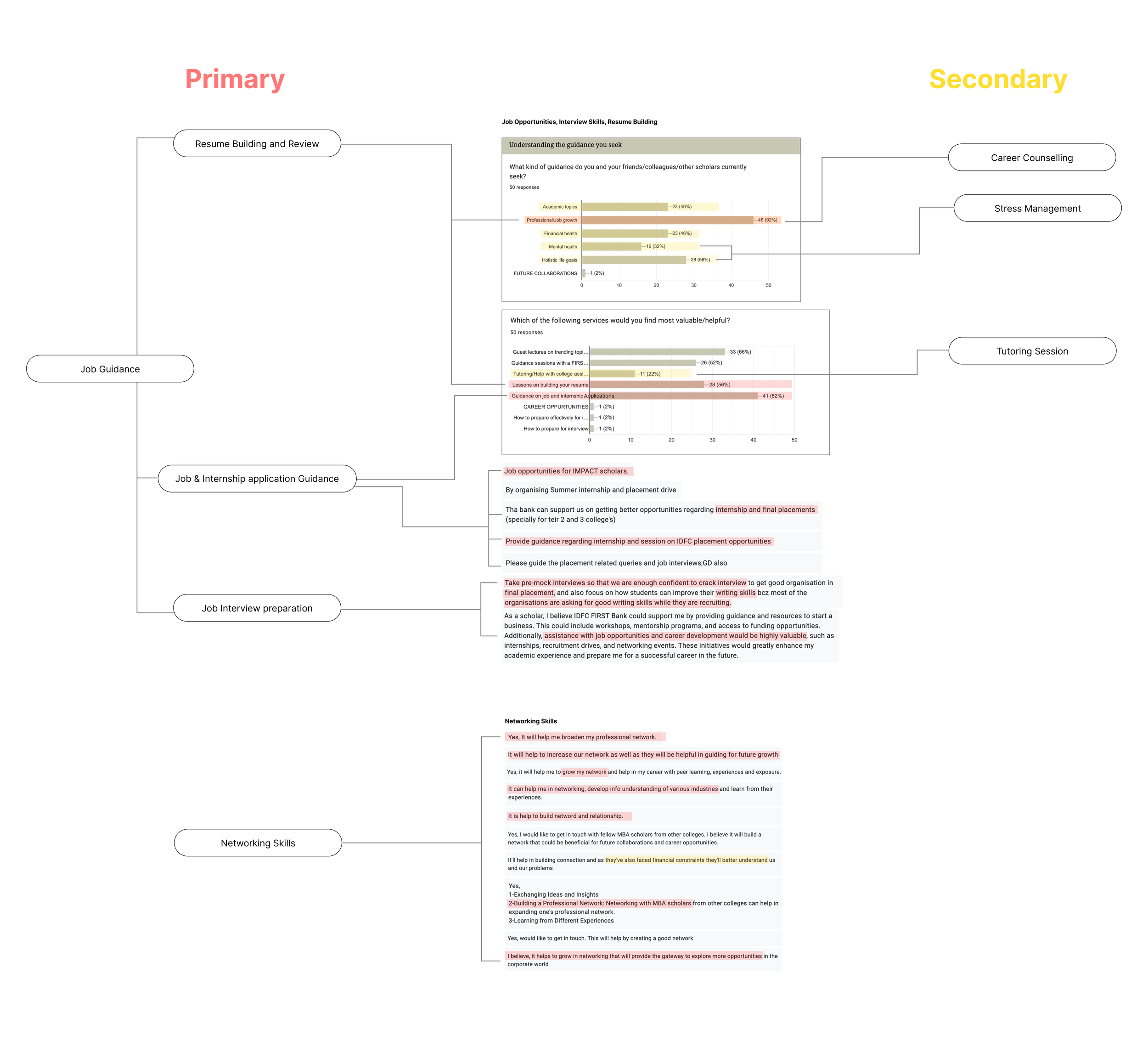
• Resume building lessons - 55%
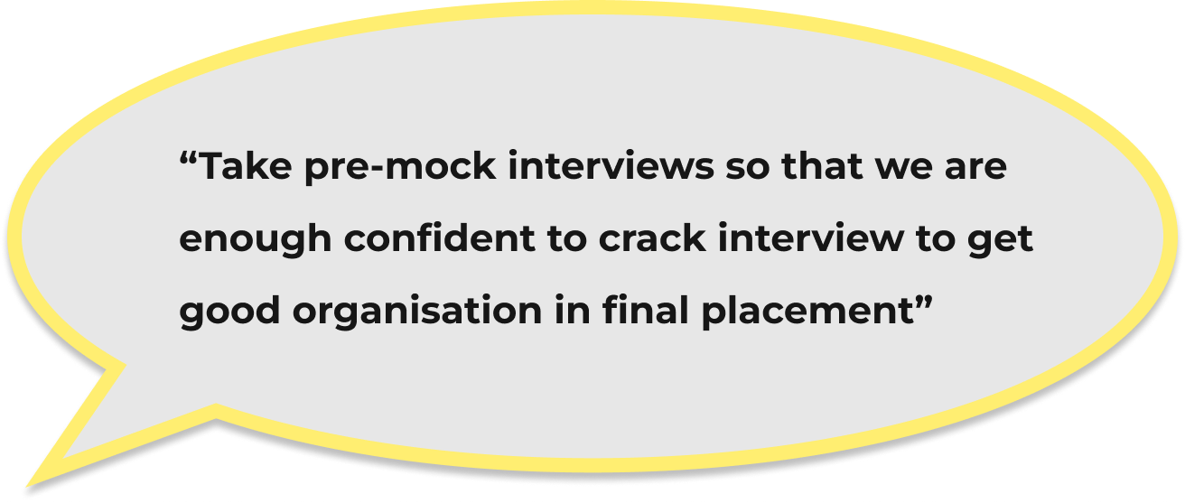
• Job interview preparations including mock interviews and feedback - 83%
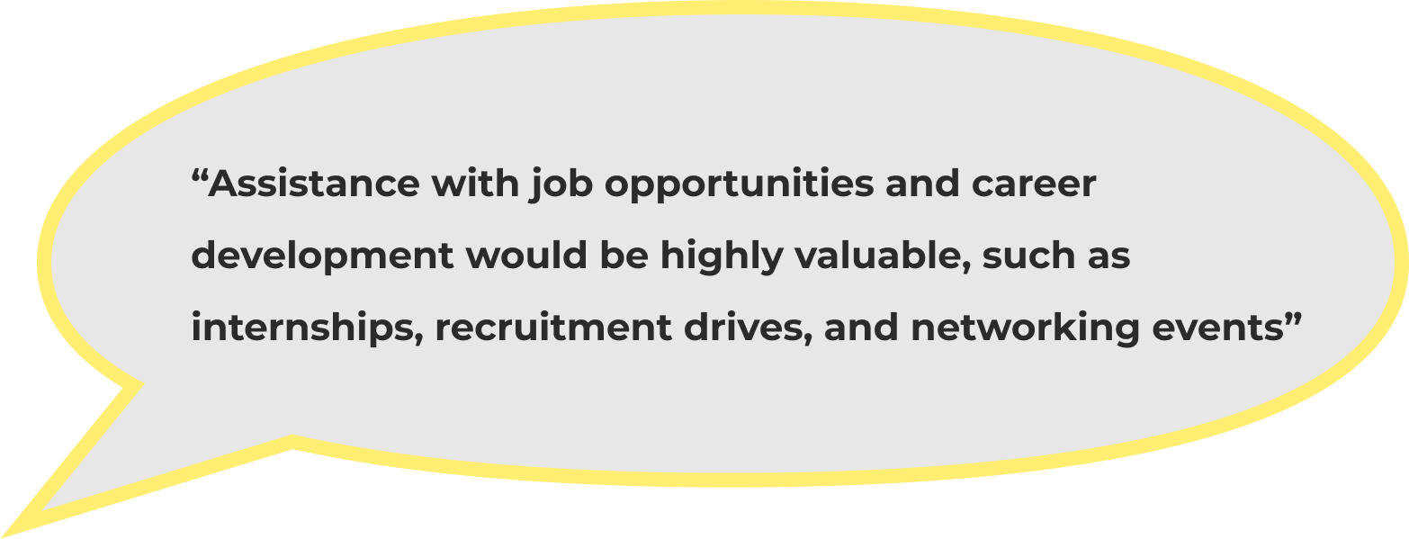
They would also love to get internships and job opportunities - 57%
Academic growth and upskilling
In terms of academic growth, students are looking for:
• Lessons on AI and data analytics from a mentor
• Additional guidance on accounting and finance from a
• Access to online resources such as certified courses, e-books and research papers
The user personas
User survey responses (48)
Looking up existing mentorship websites (heuristic evaluation)
The next step was to understand how mentorship websites are designed. To do this, I looked up existing mentorship websites and performed a heuristic evaluation of the user journeys using the 10 usability heuristic laws. It gave me references, a sense of direction and inspiration for my designs.
Scholarship student
Goals
To seek guidance on finding jobs after the MBA program
To upskill himself and stay up to date on topics related to his field
To expand his professional and academic network
Challenges
Not knowing who to reach out to for guidance and help
Not knowing where to go to expand his professional network
Mentor (Bank employee)
Goals
To be of help to the CSR initiative of the bank
To impart knowledge and wisdom (professional and otherwise) to young and driven students
Challenges
Not having a platform or way of providing mentorship
Not knowing how to reach out to scholarship students
Alumni member
Goals
To be of help to the CSR initiative of the bank
To impart knowledge and wisdom (professional and otherwise) to young and driven students
Challenges
Not having a platform or way of providing mentorship
Not knowing how to reach out to scholarship students
Mentorcruise.in
ADPlist.org
Preplaced.in
Decoding the user research findings into features
Based on the student’s responses, we found certain requirements or wants that kept repeating. There was a clear pattern of certain opportunities or kinds of guidance, they wanted from the mentors. Using this information, my team and I came up with a diagram to simplify the responses into categories. We would use these categories later on in designing the mentorship part of phase 2.
Topics that the mentors can provide sessions on (A type of filter)
Well, what about the rest of phase 2?
Based on the user research findings, it was clear that the students were very interested in networking opportunities. They wanted to improve their people skills, learn more about other industries and have a strong professional and otherwise network. They were eager to connect with others, be it students or industry professionals.
Introducing the 3 main areas of networking on the platform a.k.a the Connect tab!
Mentorship
A section where students can browse a list of mentors and book one on one sessions based on the topic of choice, work experience, profession, or department of work.
Alumni members
A section where students can reach out to alumni members of universities and colleges featured in the program.
Fellow scholars
A section where students can view and socialise with fellow MBA scholars. It is a medium to encourage networking and people skils.
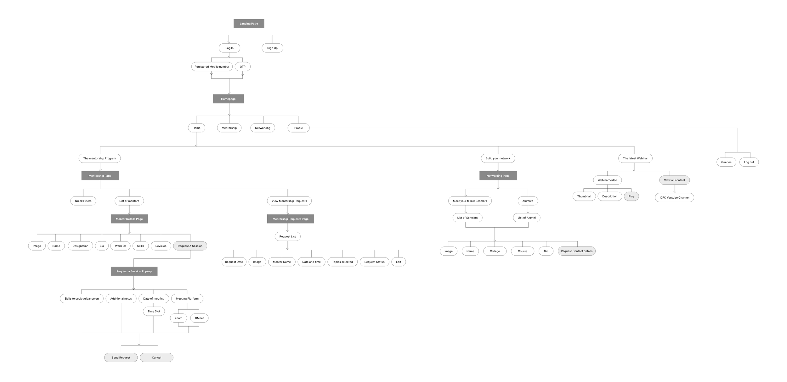
The navigation design of the mentorship program
Breaking down the mentorship feature to better understand the scope
Designing the screens (wireframe iterations)
After getting a better idea of what the platform would feature, and how the navigation could work, it was time to convert the notes and ideas into wireframes and iterate.
The mentor list page - option 1
The mentor list page - option 2
The mentor list page - option 3
The mentor list page - option 4
The homepage - option 1
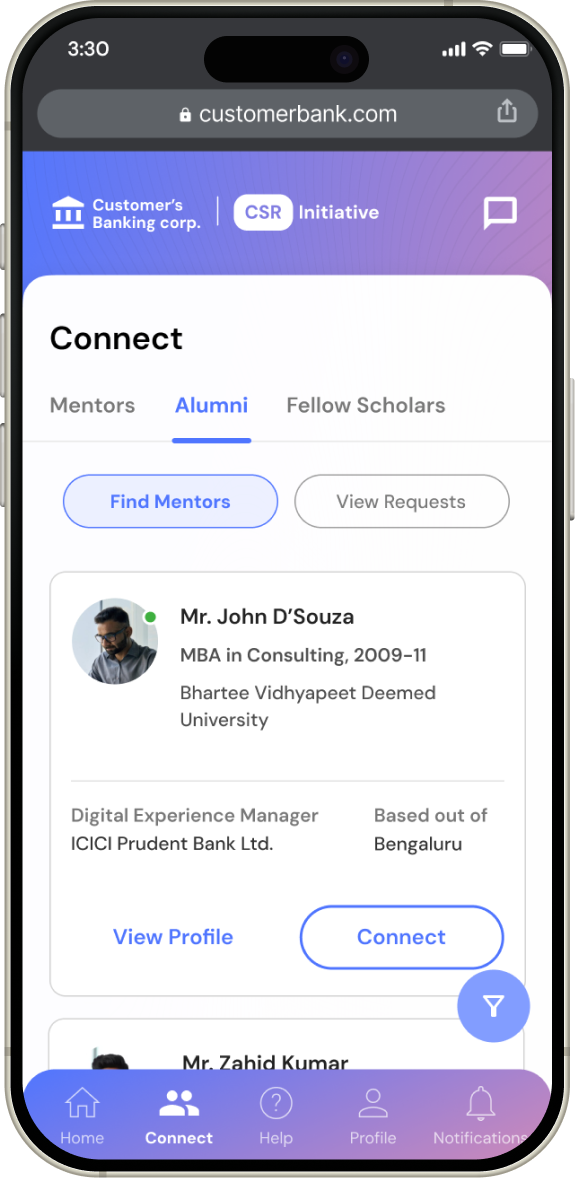
The connect tab - The socializing section of the platform
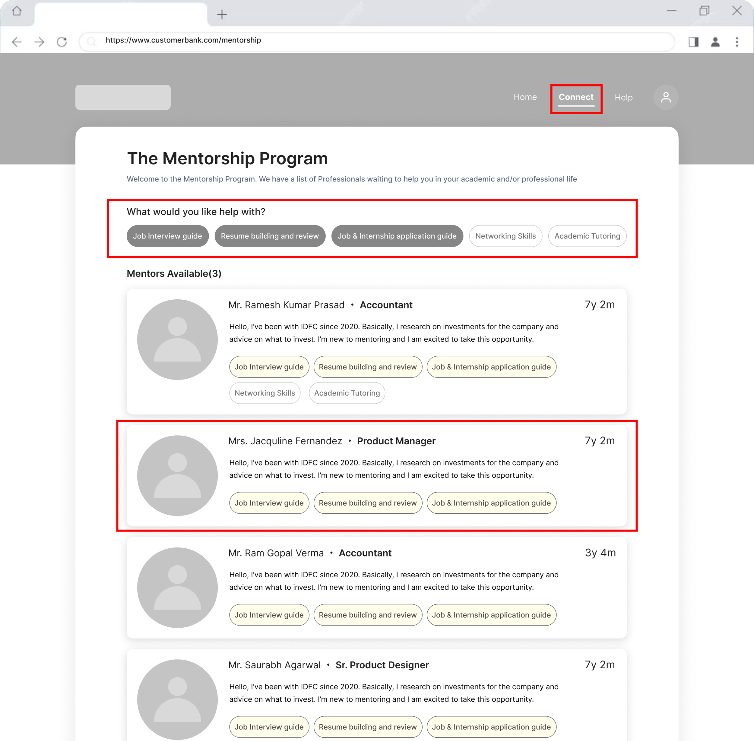
Placing the topics of mentorship as chips/quick selections to filter the long list and make it easier for students to find preferred mentors
For the first iteration of this page, I tried a wide mentor card to use the screen space better
Here, I’ve kept the filters hidden to give it a more open and flexible feel.
I also added a “former awardee” badge to the mentors as it could be a nice conversation starter. Students of the same university or college as the mentor could have a conversation where they share their own student-life experiences and bond.
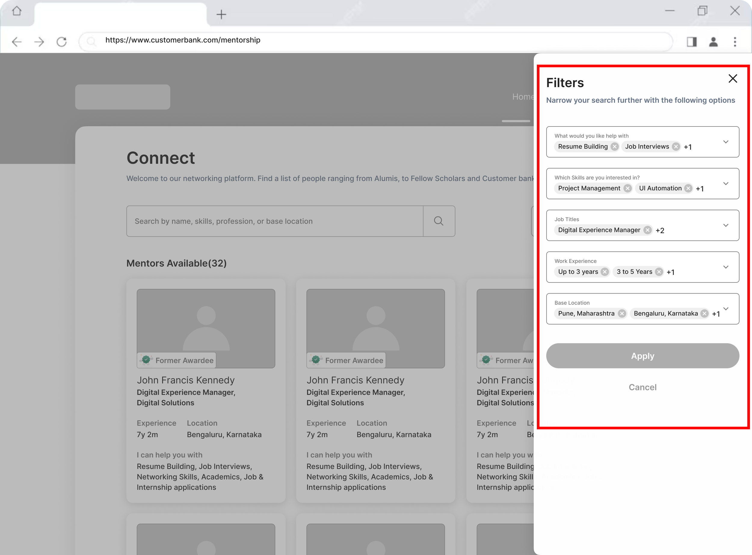
The list of filters here is much more diverse. It includes options such as:
Mentorship topics
Mentor’s professional skills
Mentor’s job title
Mentor’s work experience
Mentor’s base location
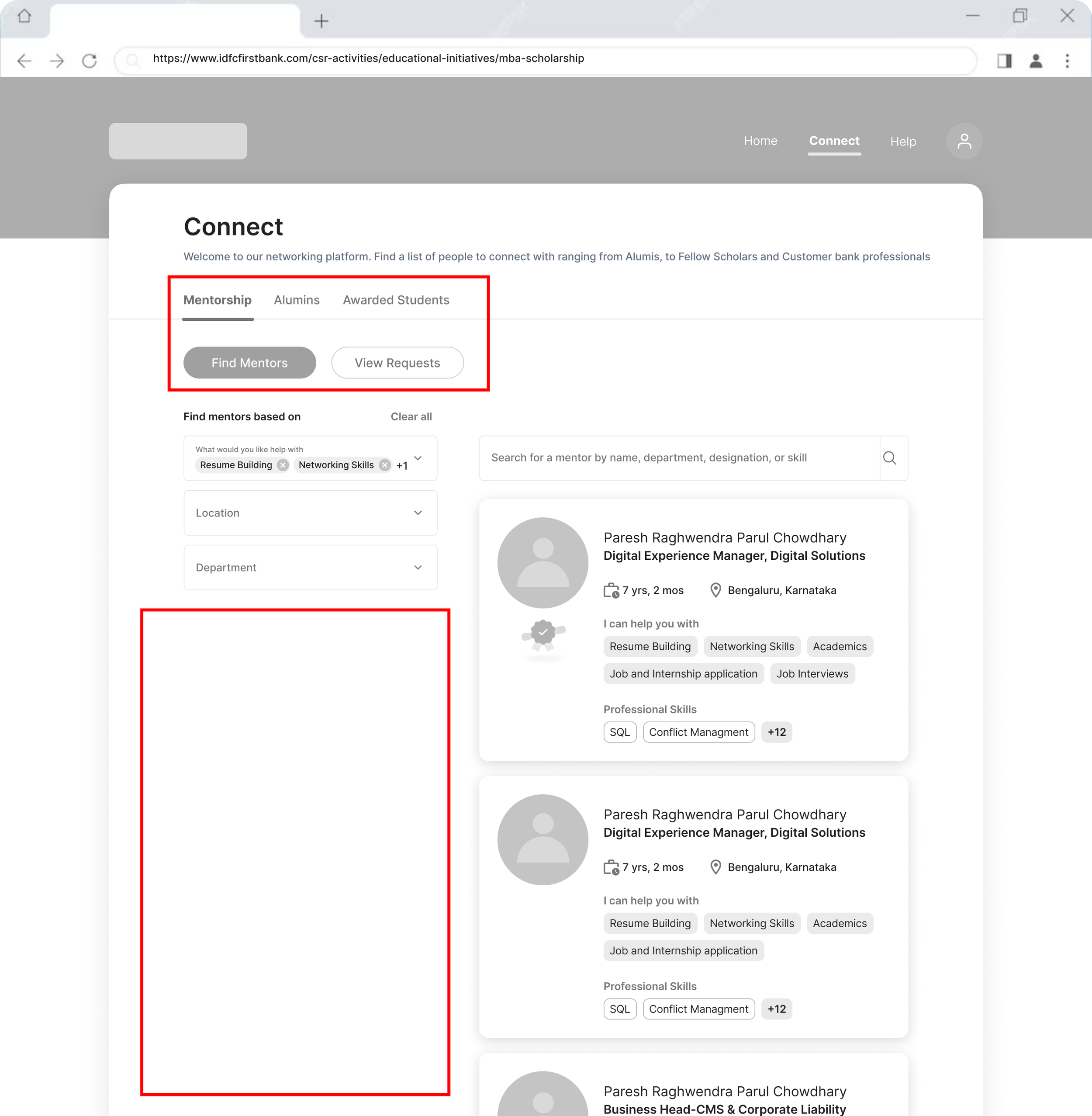
As the connect tab is not just about mentorship, I added the 3 tabs - Mentorship, Alumni and Awarded students.
I also divided the mentorship page into the mentor list and mentorship requests sections respectively
Although this design is more neat, clean and tidy (More breathing space overall), it seems to me that a good amount of screen space is being wasted.
In the fourth iteration, I used the same card design as the one above.
However, I resized the cards to fit within the defined grids of the page. This makes much better use of the screen space
I also added a micro-interaction where the student can see all the professional skills of the mentor by hovering.
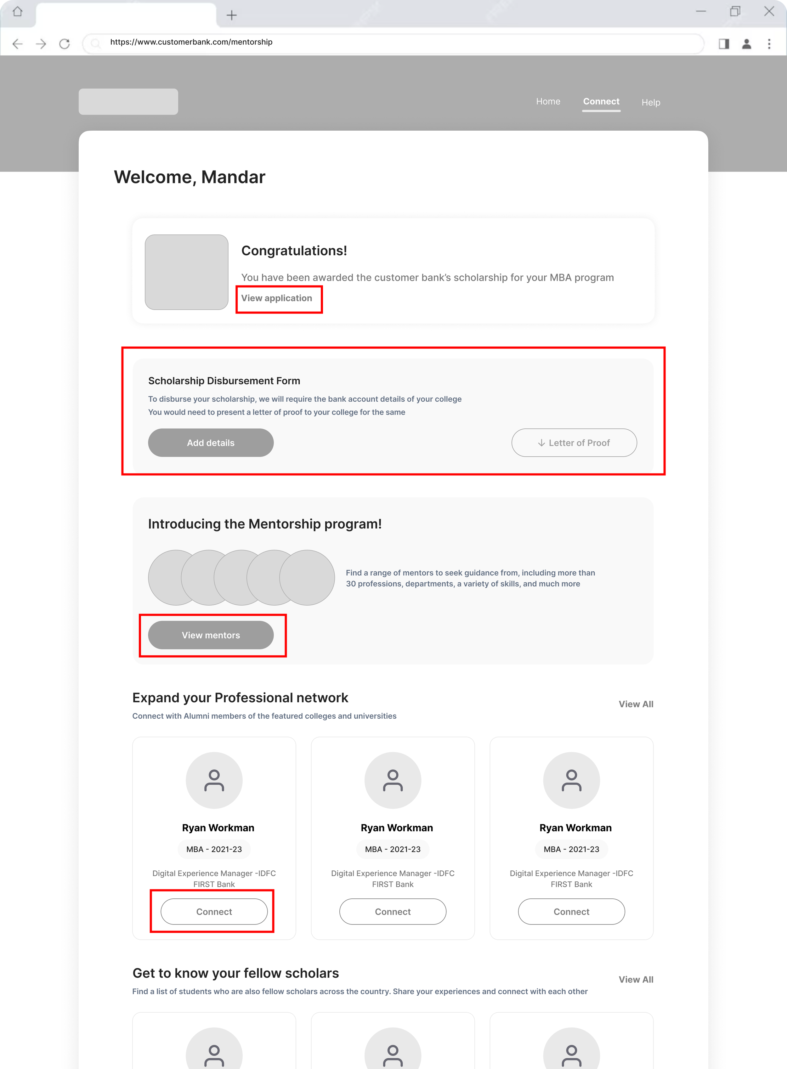
Awarded students can see a congratulations message at the very top of the screen with an option to view their application for reference
Certain students who applied for the scholarship program post admission are required to submit a disbursement form to their college
Giving students a glimpse of the mentorship program here
Showcasing the networking roster and option to connect with alumni members and fellow scholars
The homepage - option 2
Here, I tried another Visual Design option for the mentorship card to make it appear more interesting
Showing students the latest webinars and lectures on the homepage would increase the engagement chances
I tried to make the connect with alumni feature more interesting by creating a carousel design inspired by the “Dock” found on Macbooks
Mentor details page - option 1
A short bio about the mentor along with a link to their LinkedIn profile for more info
Topics that the mentor can provide sessions. The topics that the student is looking for are highlighted here for relevance
Having a carousel of the mentor’s reviews increases his or her legitimacy and makes it more likely for the student to book a session
A similar mentors section based on information such as topics, skills, profession and department of work
Mentor details page - option 2
Overall, this page design is clean, minimalistic and appears more friendly.
Rather than showing the student testimonials/reviews up front, I have added the overall star score here that also acts as a link to the mentor reviews section
Similarly, I have separated the mentor’s personal, professional and education details into tabs to avoid the page from becoming cluttered and lengthy
One downfall of this page design is that there is no continuation here—as in, no similar mentors section or connect with fellow scholars section to keep the user moving forward
Mentor details page - option 3
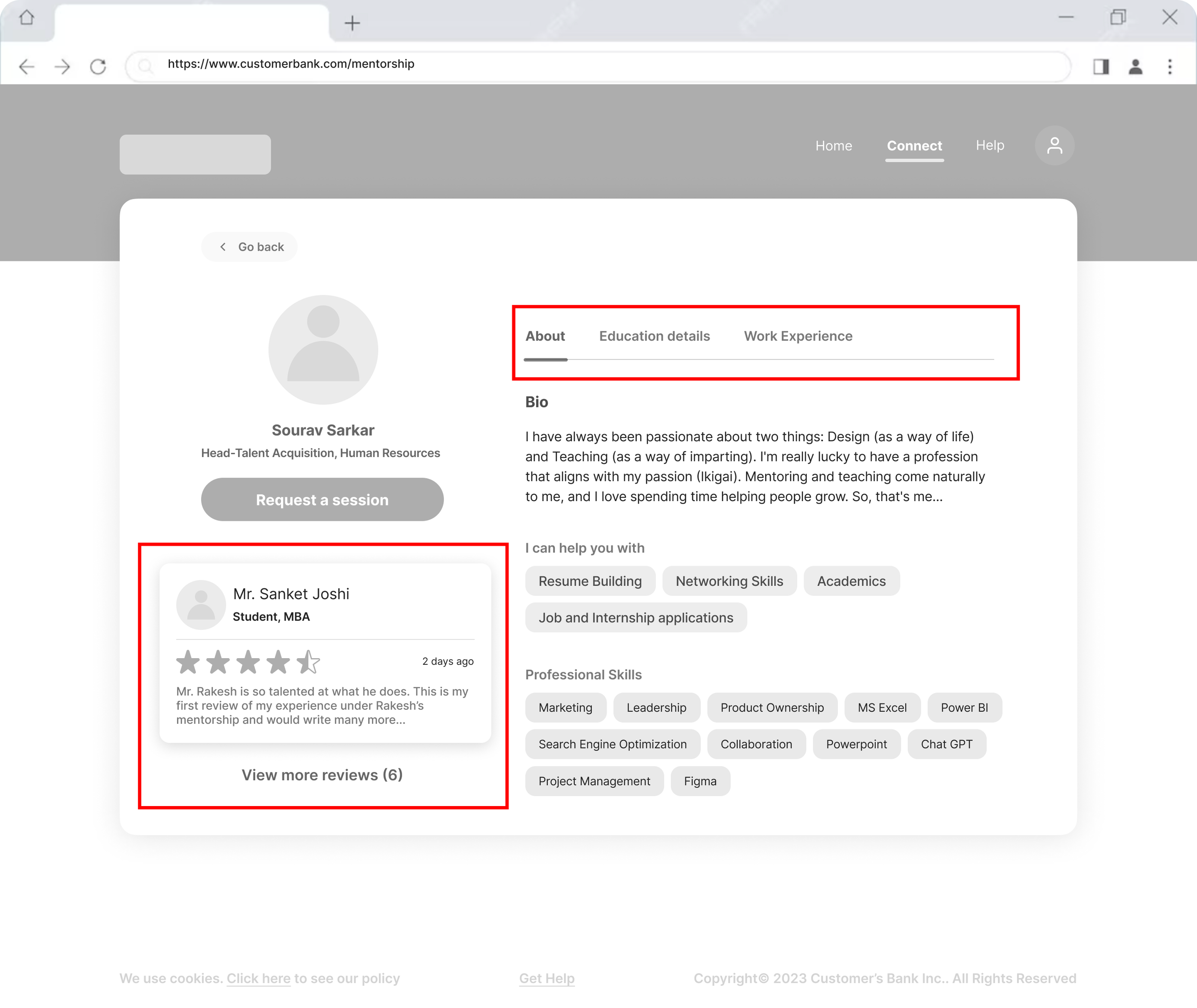
With this iteration, I was able to make the design even more clean and minimalistic. I made better use of the screen space by adding tabs at the top.
I added the latest student review card with a link to other reviews here itself. It adds more legitimacy and keeps the user more informed than simply showing their star score.
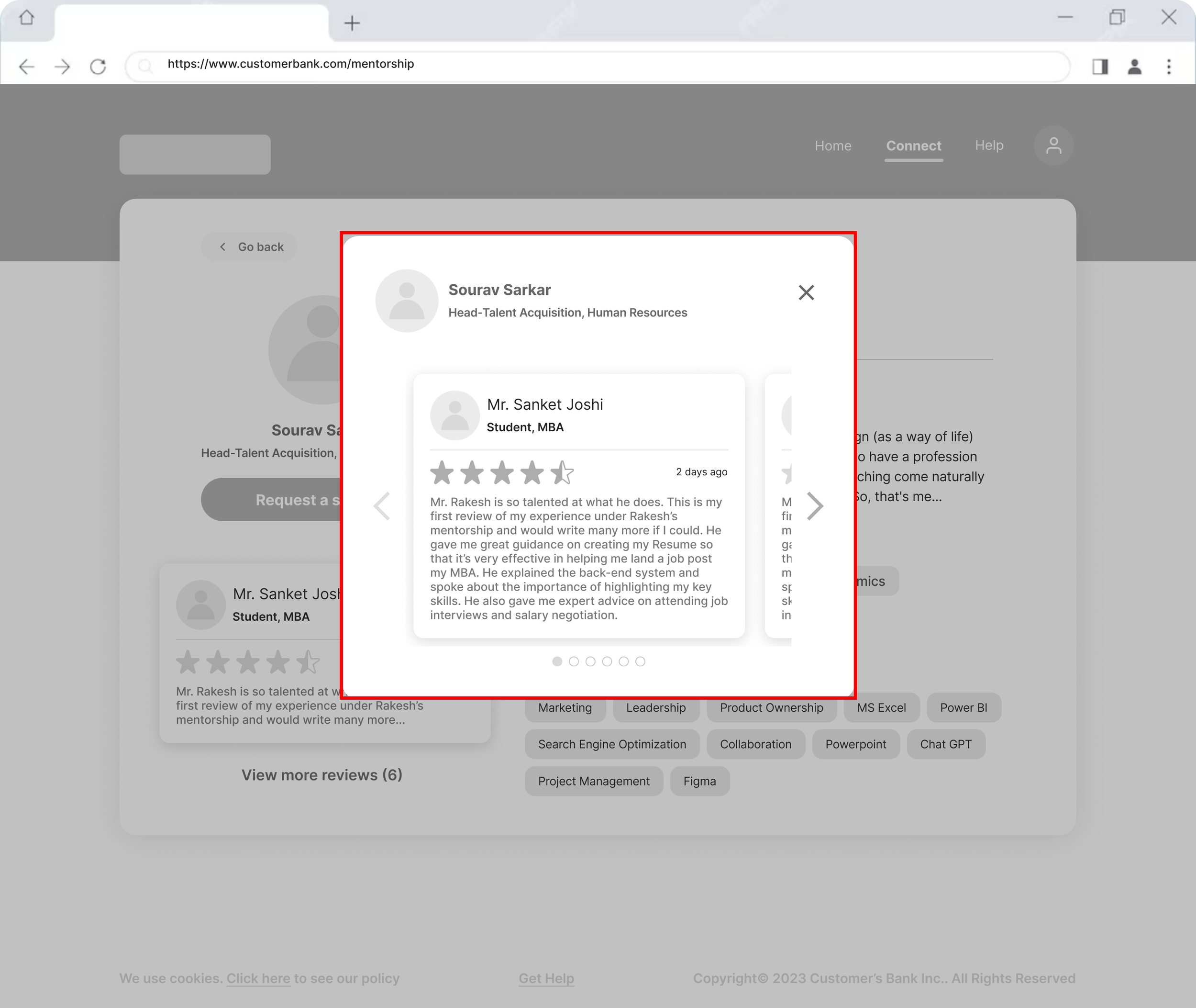
On clicking “view more reviews”, the user can see what other students have written about their experience with the mentor in this overlay one review at a time
Request mentorship session overlay
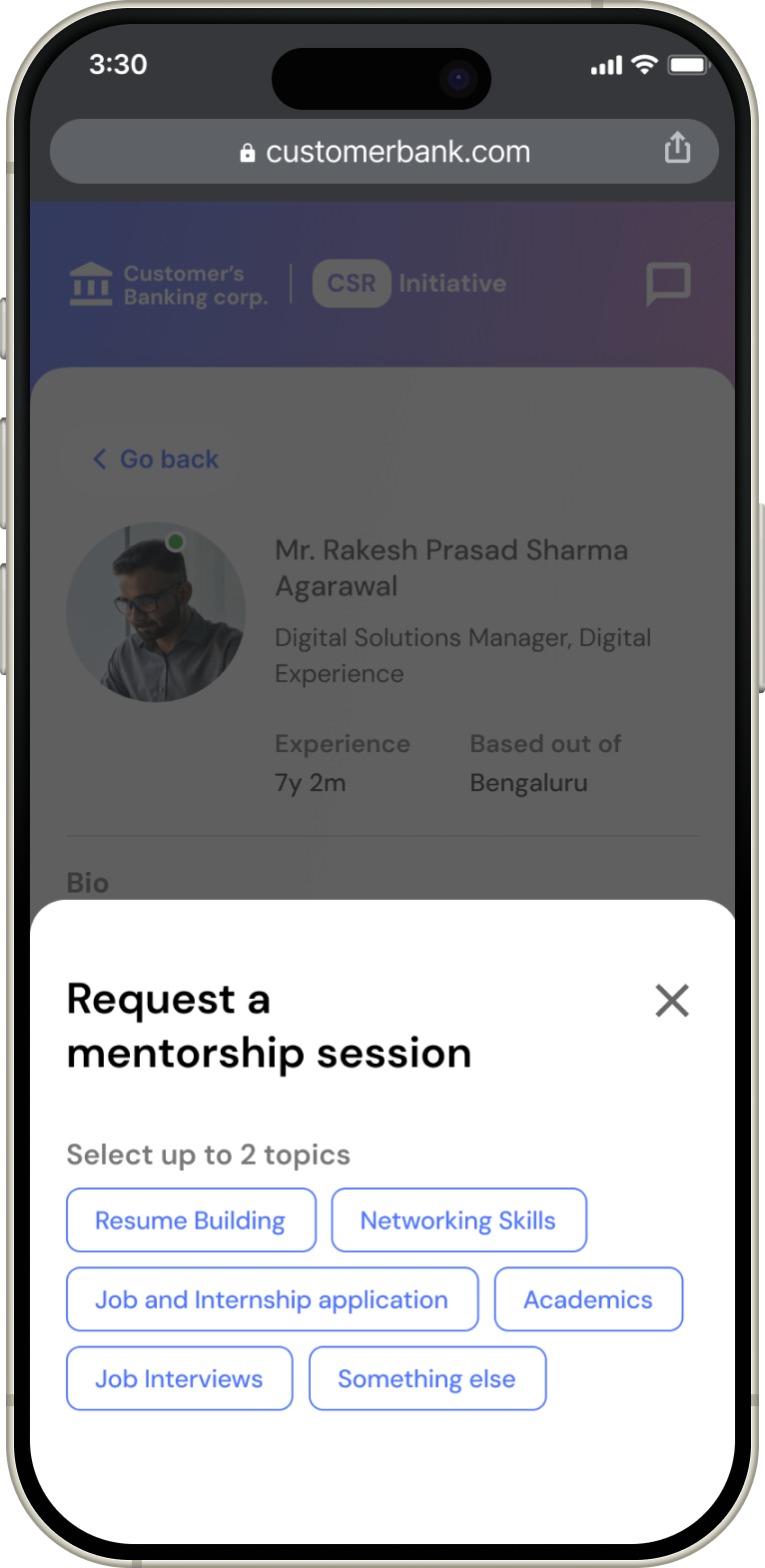
Progressive disclosure - On clicking the request mentorship session button, the student must first choose either 1 or 2 topics they would like guidance on. After that, they can select their preferred slot and add a message if they want to.
Mentor accepts request (The happy path)
When the student clicks the view requests tab, they can see all mentorship requests they have placed till date
On accepting the mentorship request, the mentor replied to the student’s message and shared the meeting link. This also generates a join meeting button on top of the card.
Mentor proposes a different date and time for the request (The not so happy path)
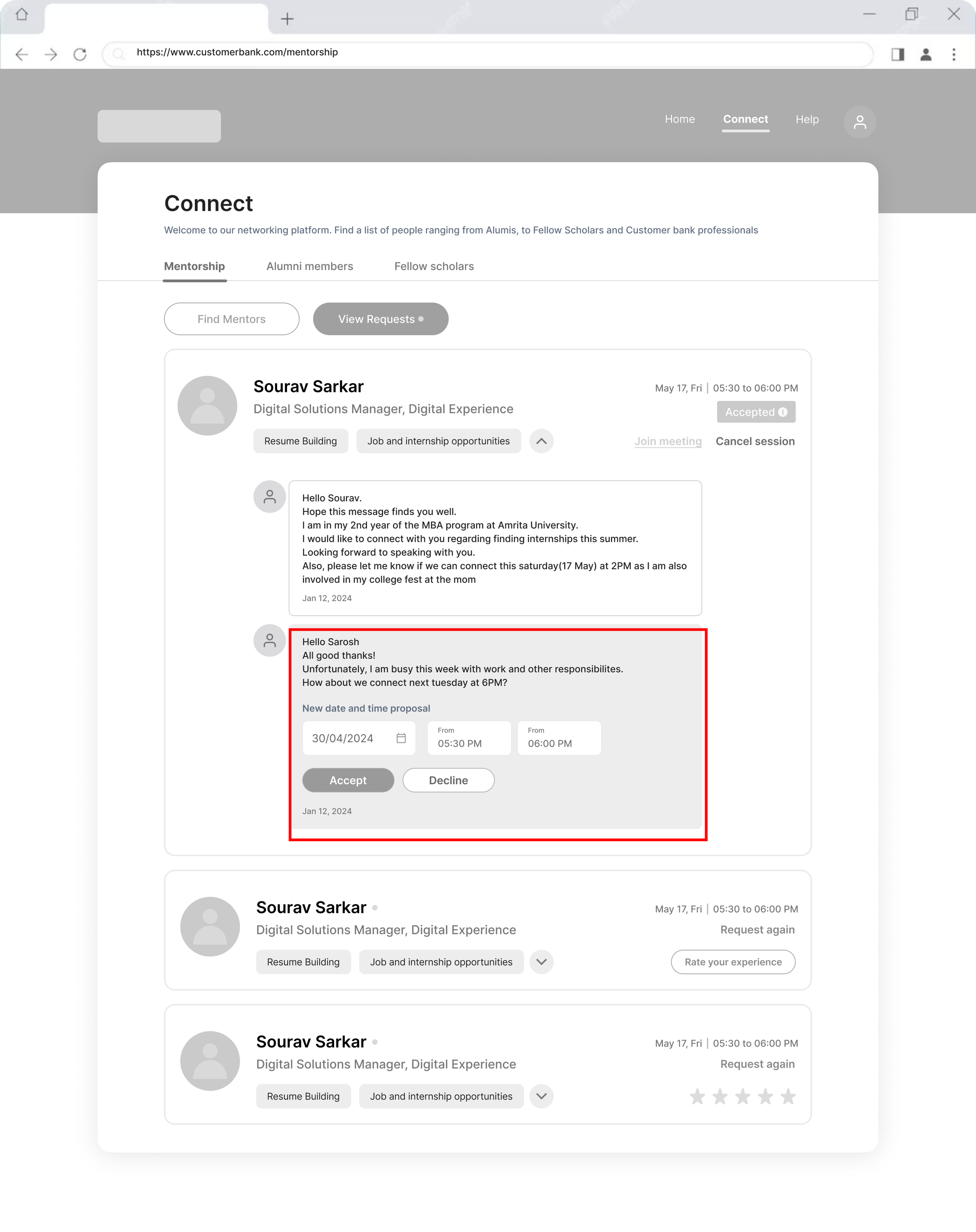
If the mentor is not available at the date and time requested by the student, they can offer an alternative.
I have intentionally kept the rescheduling to one time. Otherwise a lot of time might get wasted going back and forth without the meeting actually happening.
Also working banking professionals have a more rigid routine compared to college students.
The final product
The homepage - post being awarded the scholarship!
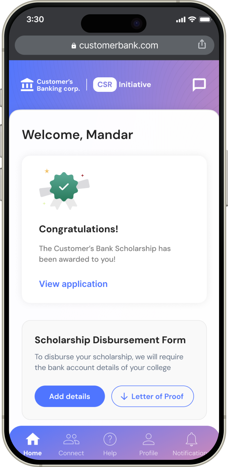
Once the scholar receives the news that they have been awarded the MBA scholarship, on logging in they are welcomed with a Congratulations message.
They can also see the new additions to the platform such as the:
• Mentorship program
• Fellow scholars and Alumni
• Useful webinars and educational content
The mentorship program - Browse the wide range of mentors
On clicking the mentorship banner on the homepage, students can view the list of featured mentors.
They can see the topics and technical or professional skills that mentors can guide them on.
The mentor details page
View all the details of the mentor such as their bio, work ex, education qualifications and skills. Students can also see the mentor’s reviews to get a better idea.
They can also browse similar mentors in terms of skills and ratings below
On clicking “request a session”, the student can select up to 2 topics, and their prefered date and time for the meeting.
They can also add a message to introduce themselves and talk more about what they need guidance on.
Book a session with the mentor of your choice
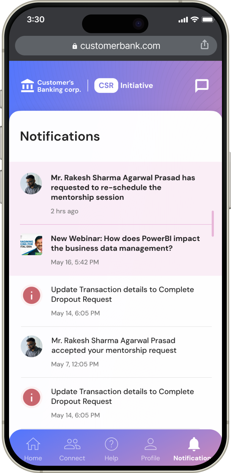
In case the date and time requested by the student for the mentorship session is not feasible by the mentor, they can suggest an alternate day and time instead (The re-schedule feature)
Networking - Connect with Alumni members
See what other mentees have to say (reviews)
Getting updates on the mentorship session request (Push notifications)
Key findings
So what all did I learn during this phase of the project?
Prioritization is key
During the product design iteration phase, my team and I had several ideas that we wanted to execute. I came to realize during the process that it is easy to get distracted or carried away and lose focus on what is most important or the "MVPs".
While going a little crazy with ideation is essential to design good products, it is also important to assess those ideas without biases. We as designers must be conscious about not getting lost or stuck in the ideation phase for too long. We need to keep the bigger picture in mind as well.
" It's not just one feature that makes a product, it is a collection of well-thought-out features that make a good product."
Micro-feedback is amazing!
Incorporating micro-feedback forms allows us to efficiently validate our product with minimal time commitment from users. This approach not only indicates whether the product functions well, but also provides insights to refine our solution.
Micro-feedback acts as a powerful tool for understanding the basics without overwhelming the user, making it an essential part of our development process.
In our case, we received an average of 4.5/5 stars through micro-feedback forms.
Conducting user research feels fulfilling
Conducting user research was invaluable for this project, which started from the ground up. My team and I had initial assumptions about the product, but collecting qualitative and quantitative insights revealed crucial gaps.
Understanding our users' motivations, intentions, and needs facilitated a seamless design process, providing clarity and direction to create a strong product.

